Recently, I was invited down to Nashville by the Vanderbilt Initiative for Smart Cities Operations & Research (VISOR) team to speak at a workshop on data-driven approaches to gentrification and equity attended both by academics and public officials. I was specifically asked to speak about gentrification and machine learning.
While I have given lots of talks on gentrification and lots of talks on machine learning – I’ve rarely combine both. When I have spoken about both simultaneously, it has either been in the Philadelphia context – a city I know a great deal about, or at the national scale.
Gentrification work requires a tremendous amount of local knowledge – and Nashville was a completely new city to me. More so, fighting for equity requires a nuanced understanding of how local residents trade off economic development with economic inclusion.
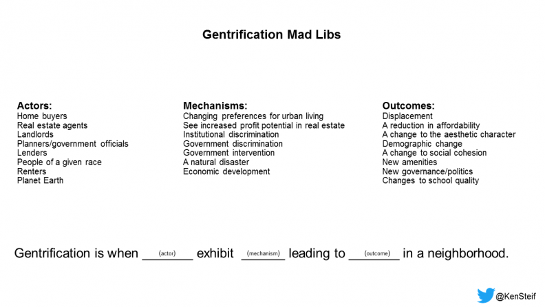
Without this local knowledge, it’s hard to even define gentrification for a given community, let alone prescribe equity solutions. This is why, as pictured above, I often play a game of ‘Gentrification Mad Libs’ with stakeholders.
Machines don’t have the luxury of dealing with nuance, like ‘equity’, ‘segregation’, ‘fair housing’ and ‘inequality. In fact, as I mentioned to the audience in Nashville, although there are several requirements of a strong predictive model, one of the most important is that we find a policy-relevant and ground-truthed outcome to predict. This is why home prices and building permits are so often used as proxies for gentrification. More on this below.
I came to embrace the idea that I knew little about Nashville before setting out to study its gentrification process. That naivete is exactly what a machine learning model would exhibit before the analyst ‘trains’ it with a set of rules describing gentrification (or some abstraction of it). This post is about identifying some of those rules.
To do so, I gathered a bunch of data from the Davidson County Assessor’s Office and the Nashville Open Data site to explore the following two hypothesis:
Hypothesis 1: Households increasingly prefer urban locations over suburban locations.
Hypothesis 2: Households choose urban locations by trading off their willingness to pay for housing with their preference for accessing urban amenities.
Nashville – A Back to City Movement
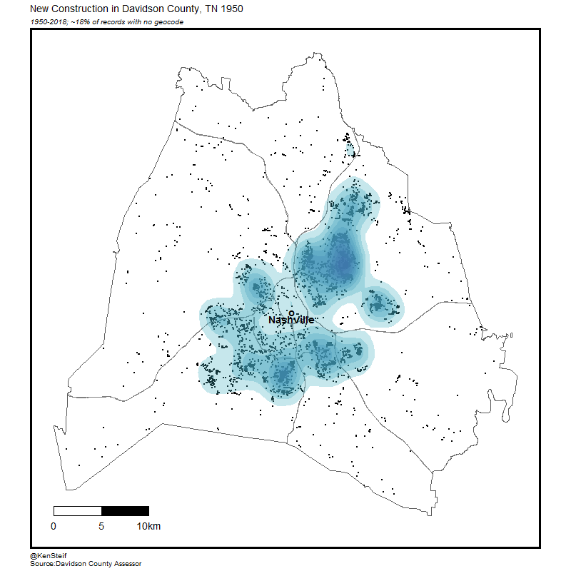
Exploring our first hypothesis, the animation below maps new construction across Davidson County from 1950 to 2018. During that time an amazing transformation occurs. In the latter half of the twentieth century development sprawls out across the county only to make an about face beginning in the early 2000’s as developers begin to favor the urban core.
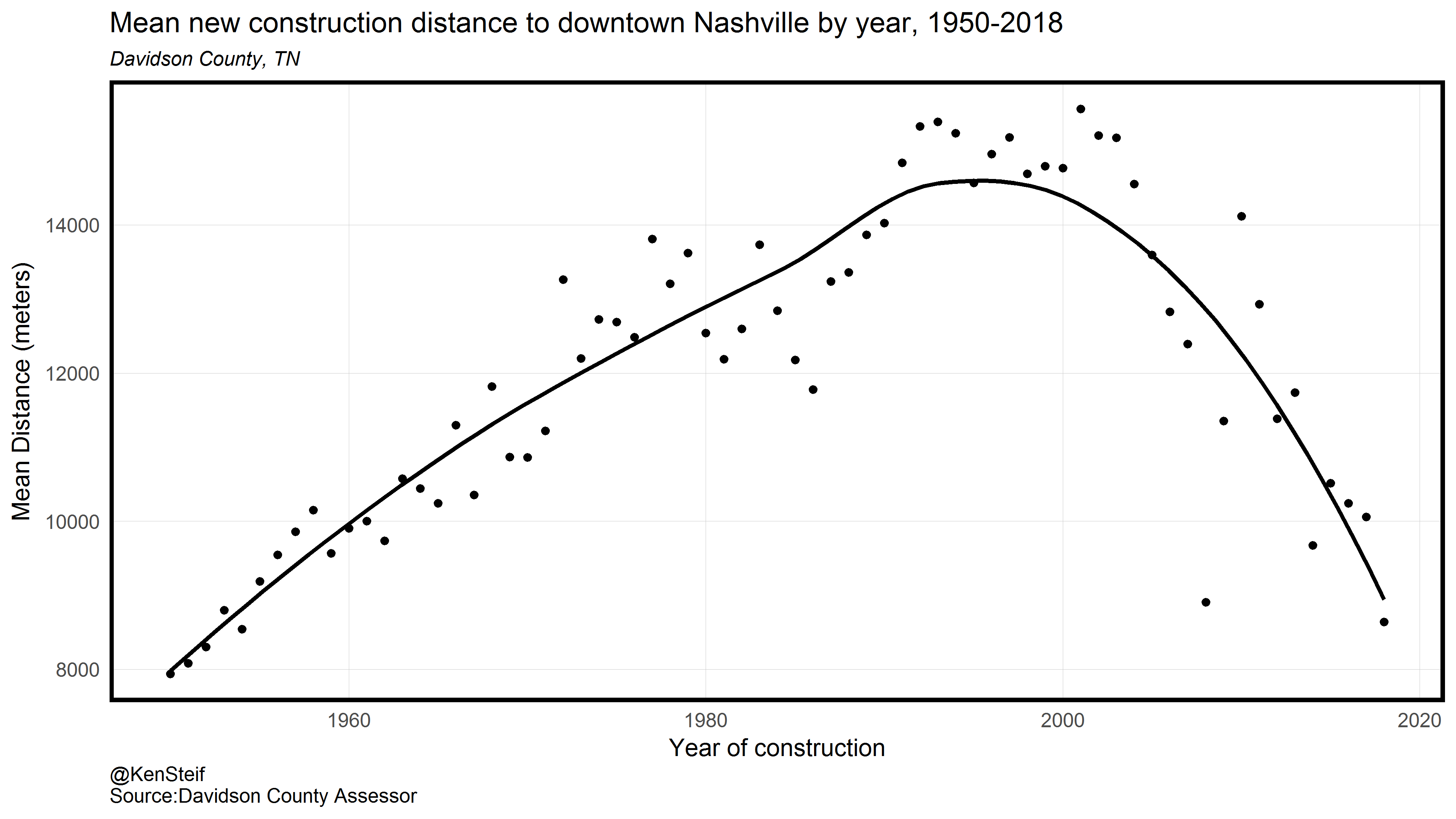
The image below shows the above process in scatterplot form. The plots shows year on the x-axis and mean distance to downtown Nashville on the y-axis. The way in which sprawl meandered its way out to the hinterlands over the first 50-years stands in stark contrast to the exponential rate with which development returned to urban core after 2000.
Further evidence of a return to Nashville can be found by looking at home price trends between the Urban Services District, an area surrounding Nashville and the General Services District, an area comprising more suburban and rural locations.
The plot below illustrates single-family home price indices and 95% confidence intervals for both Districts. It is clear that after the 2000’s capital favored urban locations over exurban locations. 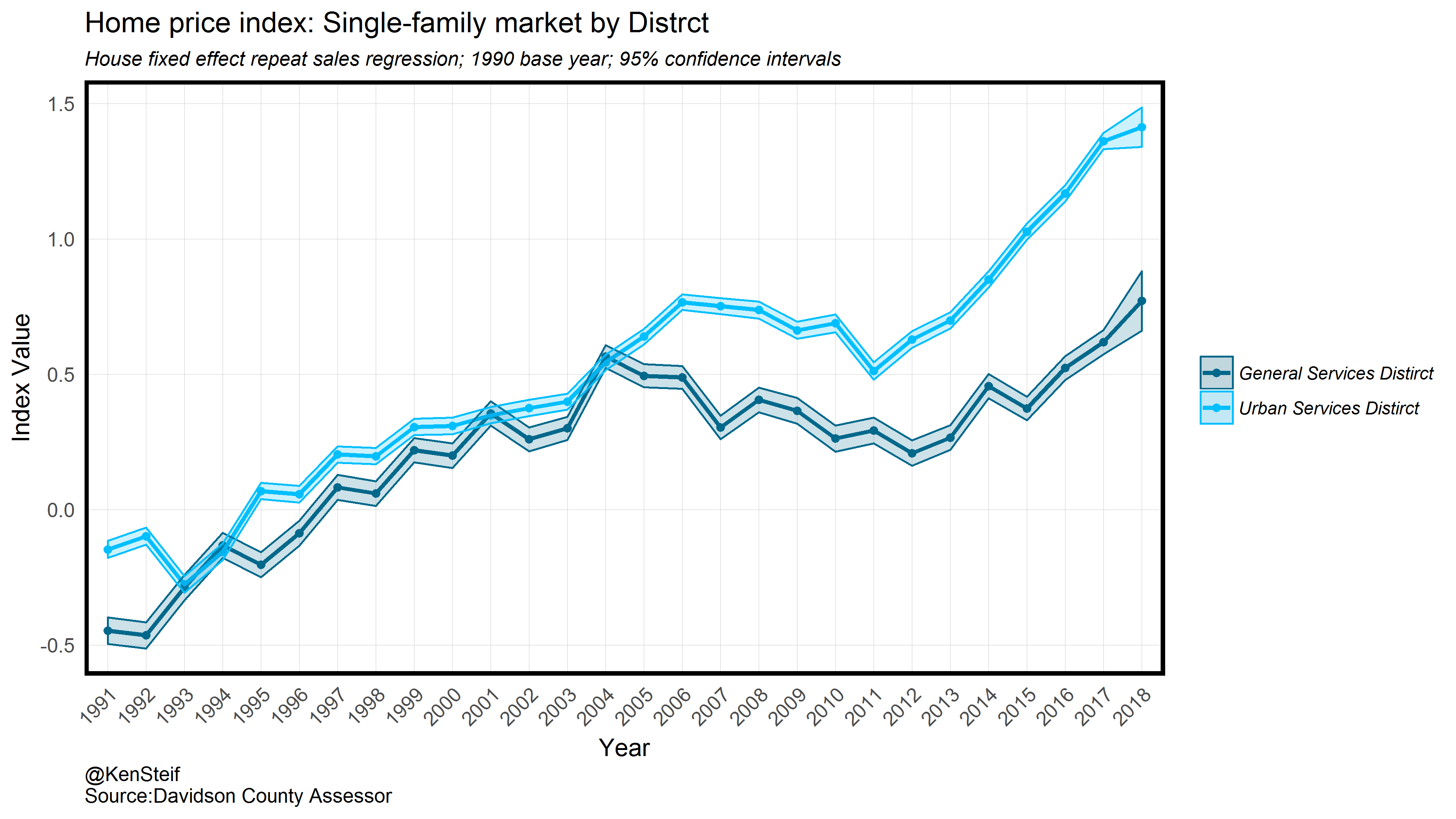
I was also curious if home buyers exhibited a willingness to pay for the public services residents receive when living in the Urban Services District, including garbage collection, curbside recycling and street lights. To do so, the plot below illustrates home prices as a function of distance to the Urban Services District boundary for three time periods. A distance of 0m represents the boundary while 10,000m represents areas in and around downtown Nashville.
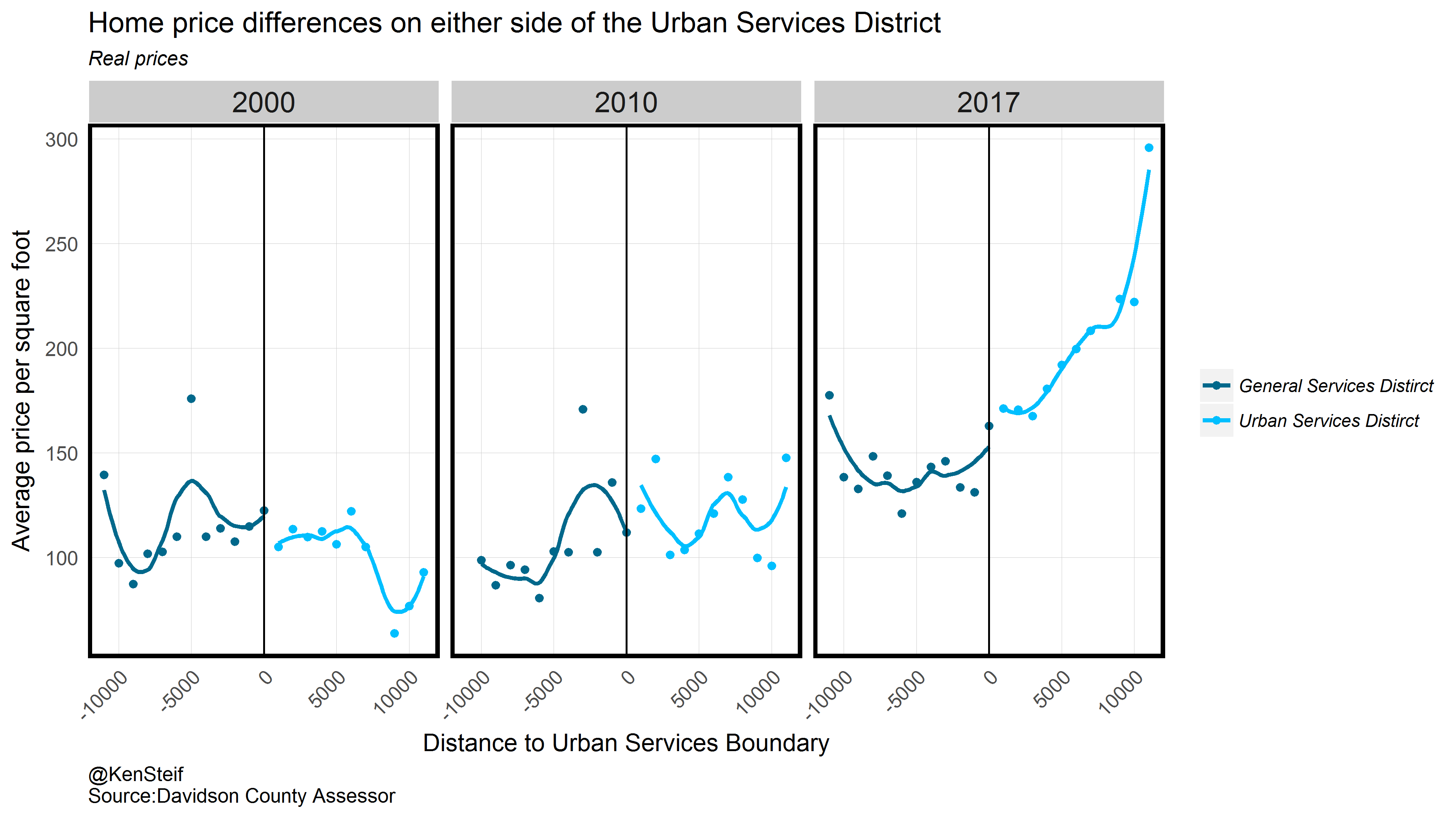
It appears that there is little willingness to pay for those additional services – at least using this very illustrative approach. The plot does show however, that home buyer’s willingness to pay for centralized locations has increased dramatically over the last two decades. Taken collectively, we can clearly uphold Hypothesis 1. Capital has returned to central Nashville.
Nashville is not the only city to experience renewed demand for urban land however, unlike New York and San Francisco which are relatively supply inelastic and inundated by NIMBYs , I was curious if Nashville, given it’s history, was able to absorb much of this demand by increasing supply.
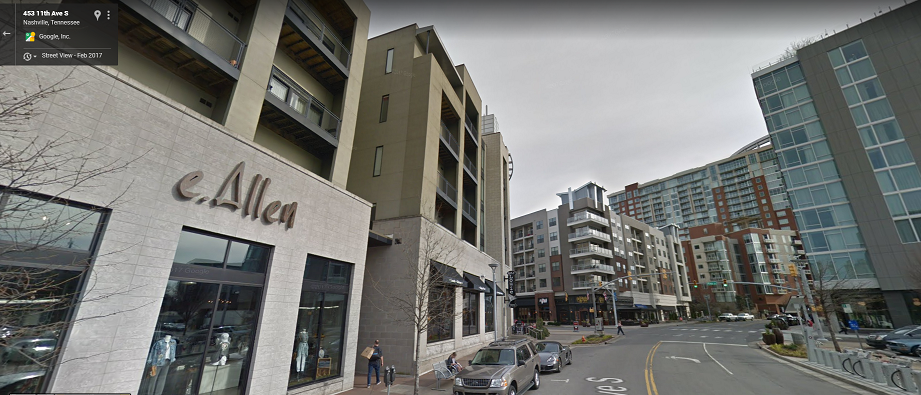
Sure enough, I spent my first night in Nashville enjoying ribs at Peg Leg Porker, located in The Gulch neighborhood. Once an expansive rail yard developed before the Civil War, The Gulch fell into disrepair at the time of America’s de-industrialization, surging back to live in the early 2000’s following a series of public/private development projects. The result, as seen in the image below, an entirely new neighborhood has emerged in The Gulch.
Towards predicting gentrification in Nashville
Above we posited a second hypothesis – that households increasingly choose urban locations by trading off their willingness to pay for housing with their preference for accessing urban amenities. This is dynamic is often referred to as endogenous gentrification, a phenomenon we discuss often on this site.
The way to think about endogenous gentrification is to imagine that you would like to move into the neighborhood with lots of social, cultural and recreational amenities but you cannot afford the steep rent. Instead, you move to the outskirts of that neighborhood or even the next neighborhood over where those amenities are readily accessible but at a reduced cost.
When you play this pattern out over time and space, gentrification (or a proxy of it) appears to sweep across the landscape like a wave. We recently wrote a post discussing this phenomenon in Philadelphia, but it seems like this dynamic can also be found in Nashville as the animation below shows.
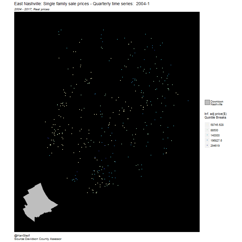
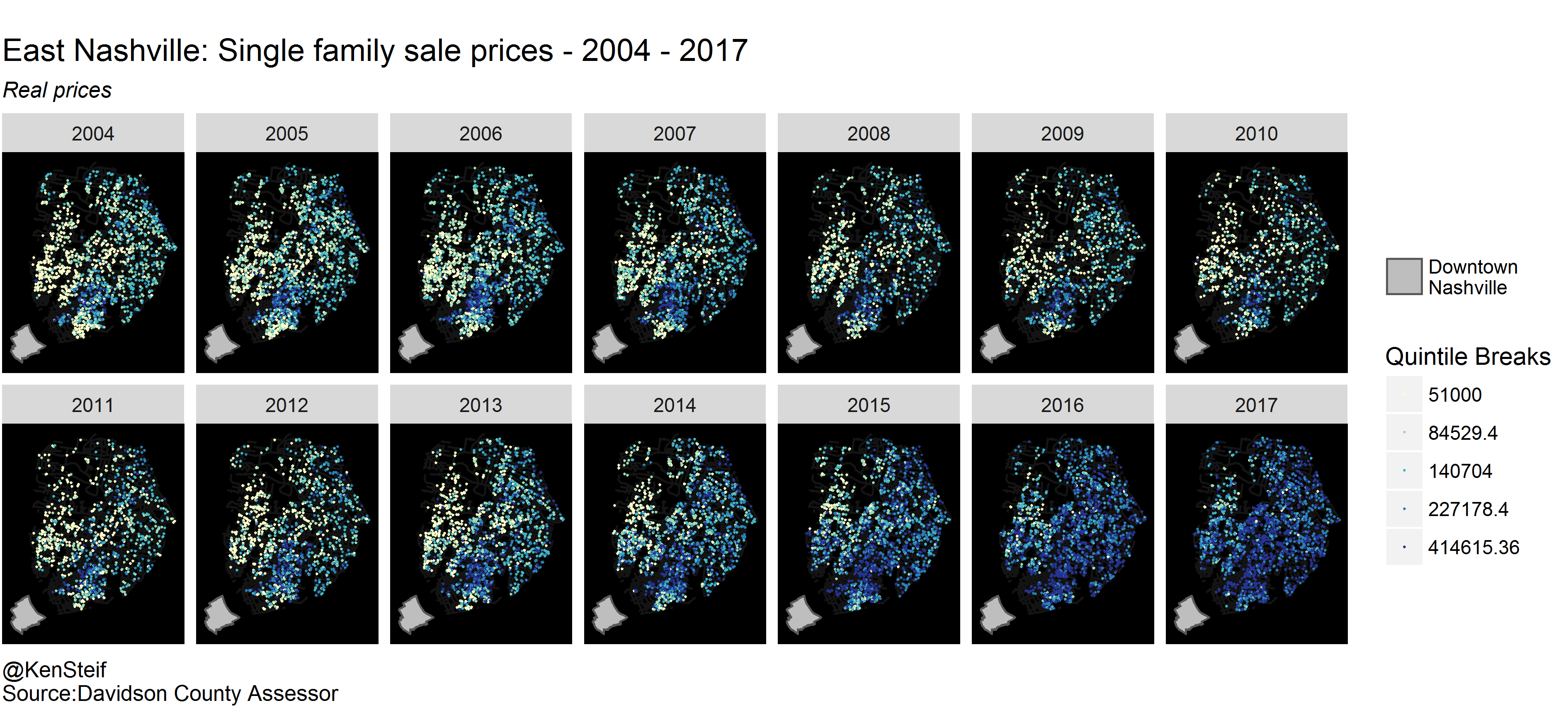
Here we see single family home prices in the East Nashville neighborhood between 2004 and 2017. If you look closely, you can see high prices emanating outward from an area in the south central portion of the neighborhood. Let’s look at this wave of gentrification with annual snapshots below.
For comparison, let’s take a look at the time/space movement of high prices in the Philadelphia Point Breeze neighborhood. This image comes from an op-ed Ken Steif recently published on using City open data for community land use decision-making. In Point Breeze, like in East Nashville, high prices sweep across the landscape over time. 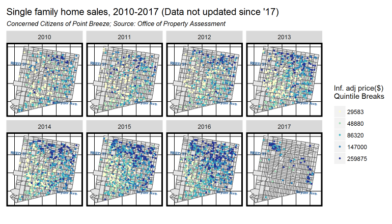
At Urban Spatial, we are working to model this wave and other relevant ‘rules’ into machine learning features that can help us predict gentrification over space and time. While home prices are important indicator of neighborhood change, others are equally important. The final part of this analysis looks at the role of building permits in the process of gentrification.
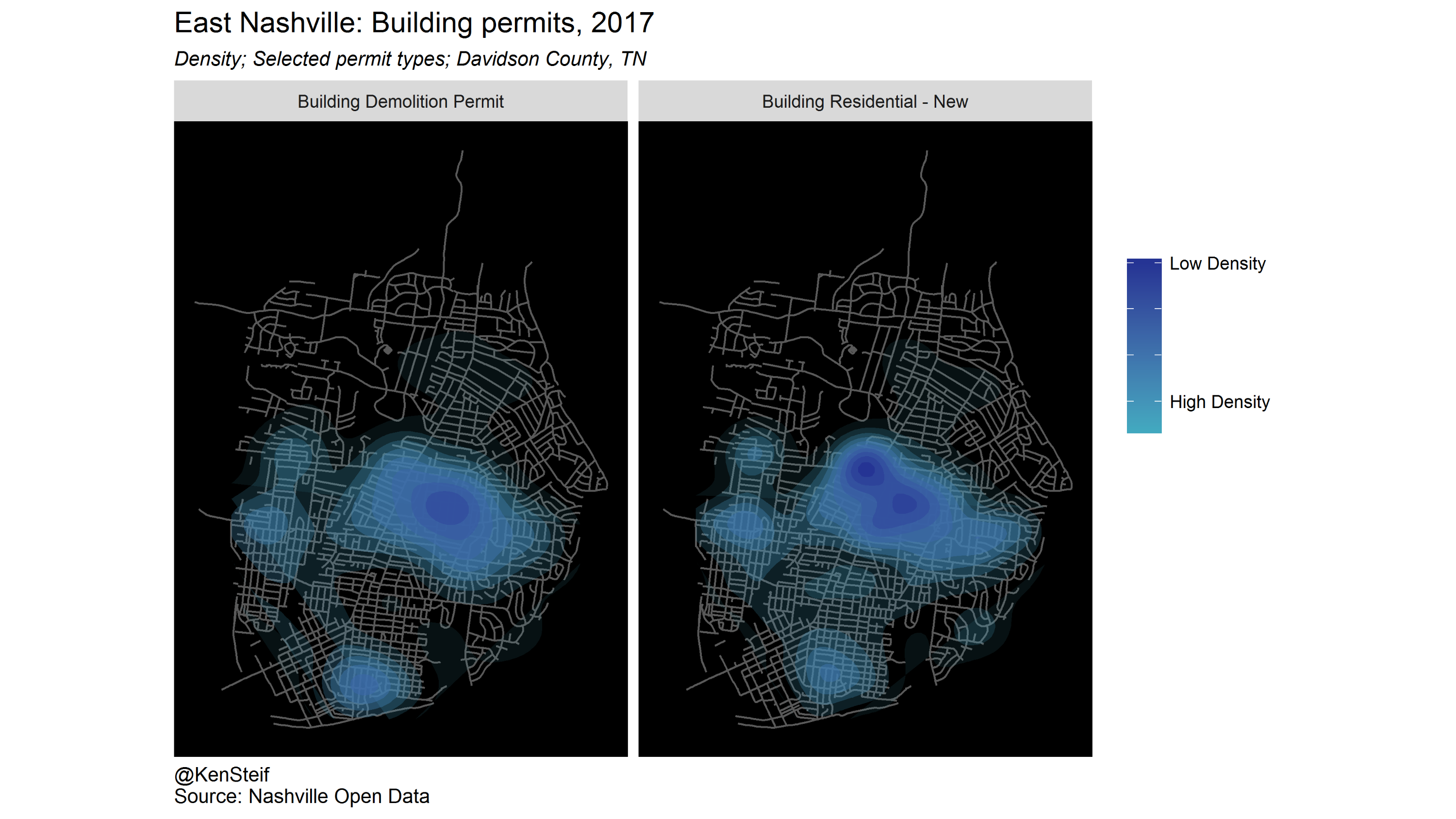
In the image below, we return to East Nashville, visualizing a spatial correlation between the density of demolition permits and new construction permits. If your definition of gentrification is a change to the aesthetic character of the neighborhood, then this plot shows were that phenomena holds true in Nashville.
Permits are a useful outcome to explore machine learning and gentrification and the final part of my talk focused on the prediction of permits. In this use case, we’re going to predict ‘demolition permit risk’. In fact, we’re going to build a very simple model predicting permits in much the same way that police departments predict crime risk in space.
The only two covariates we use to predict is distance to central Nashville and distance to the highest single family home sale prices in the previous year. Our hypothesis is going to be that the closer an area is to high prices, the more housing demand there is and the higher the probability of demolition risk. The figure below visualizes the relationship between demolition permits and high home sale prices.
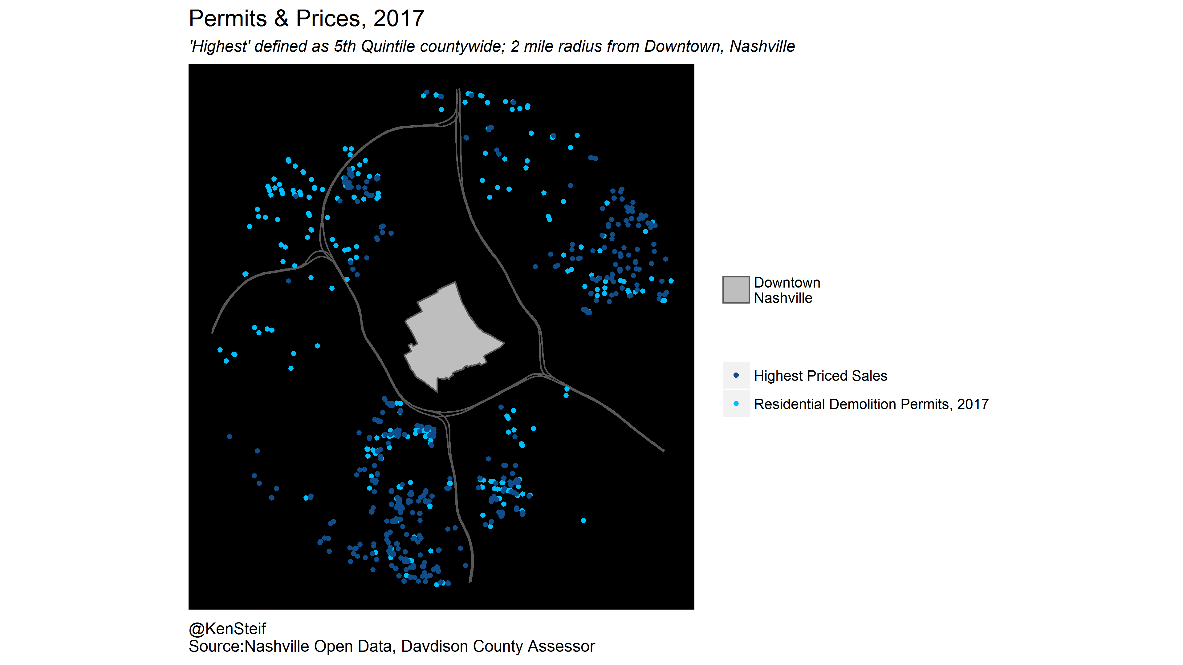
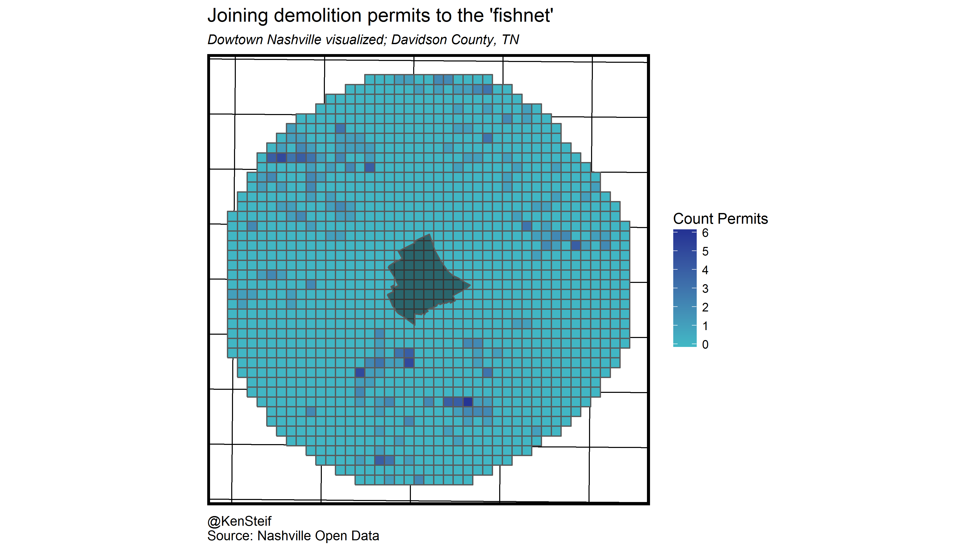
In this example, we focus on areas within 2 miles of Downtown Nashville. Here you can see that demolition permits and high price sales seem to co-locate across most of the study area with exception to areas in the northwest. The next step is to overlay a ‘fishnet’ – a lattice grid on top of our data. Below we visualize the count of demolition permits for each fishnet grid cell.
Next we measure the distance from each grid cell to its n nearest high home price neighbors as well as distance to Downtown (not pictured). We then estimate a machine learning model that returns a risk prediction for each grid cell as visualized below. As this is a simple example, we are otherwise omitting a host of extremely important validation metrics.
Below we visualize the predicted demolition permit risk and overlay the observed demolition permits. As our model is very simple, we can really get a sense for how the spatial risk model works. Recall that we trained this model on distance to high prices. While there are plenty of demolition permits in the northwest, the predicted risk is very low. This is because our only independent variable, distance to high prices, does not account for this variation.
Conversely, there are several areas that exhibit predicted risk but are relatively far from observed demolition permits.
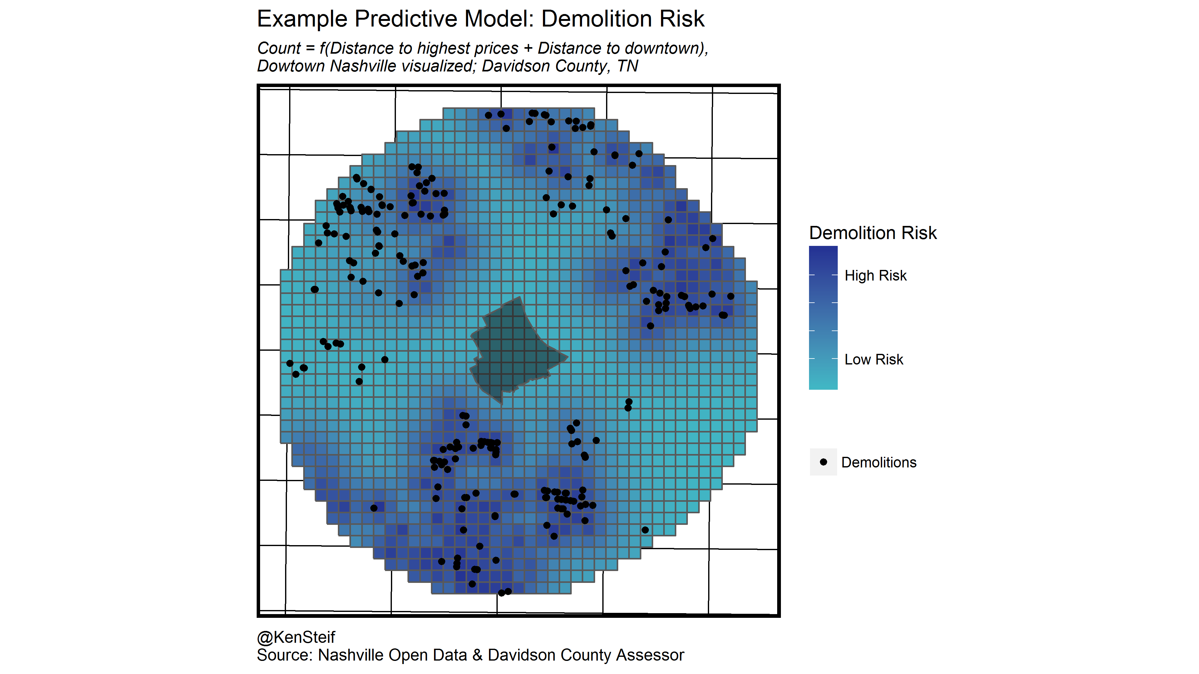
This is exactly how a spatial risk predictive model should work. The approach is not only useful for predicting areas that have already experienced demolitions, but also to help reveal areas that may be at risk despite the fact that no observed events have occurred there. If we can predict demolition and the community is concerned about neighborhood change, then we can use these predictions to guide the allocation of limited resources, from affordable housing to zoning changes.
There are lots of caveats with the analysis presented above. Foremost, is that I focus entirely on supply-side outcomes with no mention of who is doing the gentrifying. These demand-side factors are critical, but I hesitate to talk about the role of race and class in Nashville’s gentrification process without having any firsthand knowledge.
This is one reason why it is difficult to model gentrification in a machine learning context. As the Gentrification Mad Libs exercise demonstrates, the process of gentrification and any useful policy response to it, requires a incredibly nuanced understanding of the interactions between people and place. Machines do not do well with nuance.
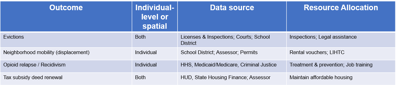
However, I do think that there are some important policy relevant datasets about both people and places that could be useful for gentrification prediction. Below are some examples of administrative data that cities and states collect. If integrated these data could provide new insights in to the process of neighborhood change and ultimately help cities plan for equity the midst of growth.
Ken Steif, PhD is the founder of Urban Spatial. He is also the director of the Master of Urban Spatial Analytics program at the University of Pennsylvania. You can follow him on Twitter @KenSteif.