Source: NASA, Earth Observatory
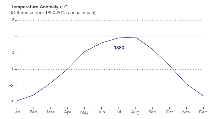
This past August, 2016 was the hottest in 136 years according to NASA. In cities, this heat is absorbed by built environment features like streets, parking lots and rooftops and reflected back on to weary city-dwellers whose only respite is water ice and Super Soakers.
Scientists call this the ‘Urban heat island effect‘, which posits that density in the built environment increases city temperatures relative to outlying suburban and rural areas. As we will learn in this post however, temperature can vary a great deal across the City as well.
Below we’ll take a look at land surface temperature maps in Philadelphia derived from Landsat satellite imagery and we’ll explore the extent to which human interventions, in this case street trees, can help lower temperatures.
Using satellite imagery to estimate land surface temperature
It is difficult to estimate small changes in temperature across space. One way is to grab weather station data from the very wonderful weatherData R package. However, because there are just a handful of weather stations reporting at a given time and they are not spread evenly throughout the Philadelphia, it is challenging to get a consistent, small-area measurement across the City.
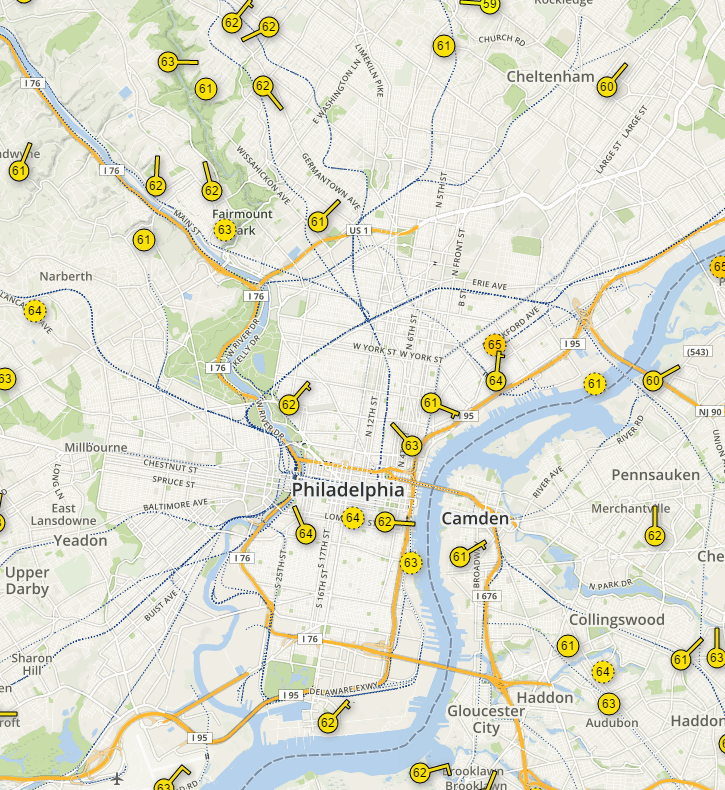
Source: Weather stations from Wundergound
Satellite imagery, specifically Landsat, provides a relatively quick way to estimate land surface temperatures. Landsat data is free and over the years, a community of very talented developers have built solutions that make it easy to download the imagery.
Landsat data is at 30 meter resolution which makes it too coarse to detect what you ate for lunch today in the park, but certainly big enough to look at temperature differences across the City. The great advantage of analyzing the world by way of satellite imagery, is that we can use traditional raster mapping analytics. Each satellite image is actually comprised of multiple band images which can be overlaid and subjected to all sorts of math and map algebra. The image below shows a natural color composite of the Philadelphia.
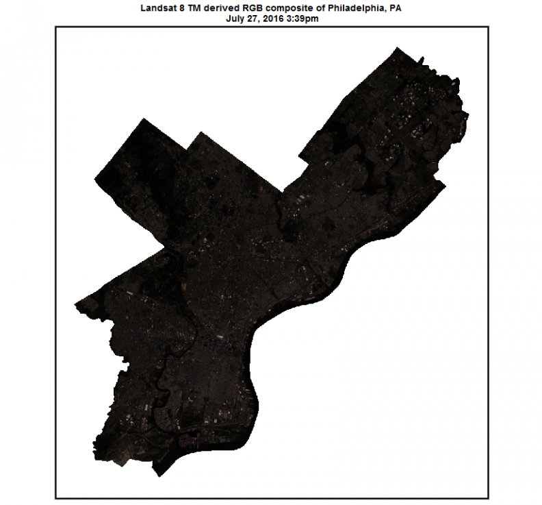
Landsat scene for Philadelphia, PA
Perhaps the most ubiquitous example of Landsat-derived spatial intelligence is the Normalized Difference Vegetation Index (NDVI) which is a very simple indicator showing how the intensity of vegetation can vary across the landscape. The image below is an NDVI for Philadelphia. The map illustrates a stark difference between the developed areas in Center City and Fairmount Park running northwest through the City.
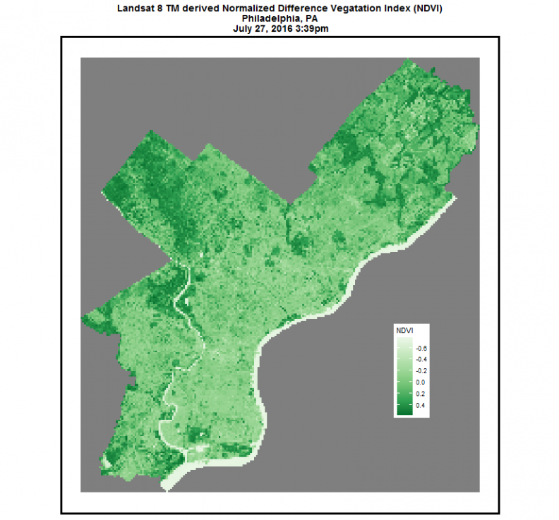
NDVI – Philadelphia
To convert Landsat imagery to a land surface temperature map, a number of steps have to be undertaken. The data has to be ‘cleaned’ using a atmospheric correction algorithm and then subjected to several transformations. If you’re interested in doing this on your own, here is a great video tutorial.
To ensure a robust analysis, I chose imagery taken from the middle of the afternoon on a very hot day. On July 27, 2016, Wunderground reported a high of 93 degrees in Philadelphia. Despite the fact that we’re used to digesting temperature information on a citywide scale, the below image of land surface temperature makes it clear that temps can very dramatically within the City as well.
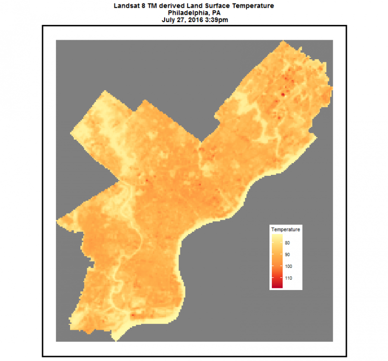
Land surface temperature, Philadelphia
On that hot Wednesday in July, it seemed the only places to catch a break from the heat was Fairmount Park again, to the City’s northwest or Pennypack Park in the northeast.
As a better demonstration of how much surface temperatures can vary across the City, the image below shows areas that were estimated to be warmer than the stated 93 degree high on that day. The image well illustrates the concept of urban heat islands.
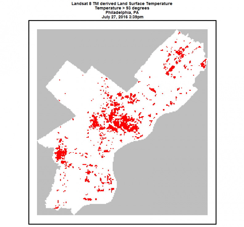
Areas with land surface temperatures greater than the 93 degree high for the day
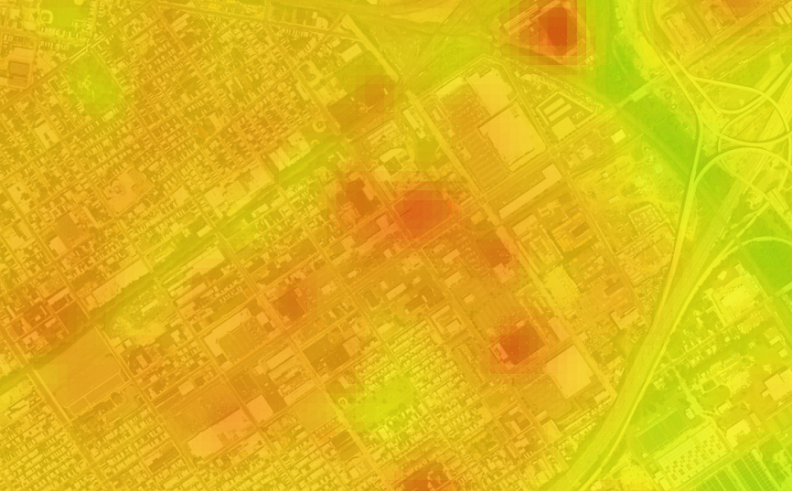
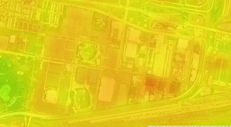
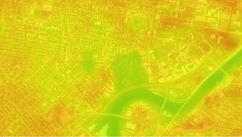
If you are interested to see how heat islands effect your neighborhood, check out the interactive map below which overlays a transparent land surface area map on top of raw satellite imagery. Make sure you zoom in on the hottest areas of the City to see what is driving the warmest hot spots.
Interactive urban heat island map – Philadelphia
The 30m resolution imagery is certainly sharp enough to notice some interesting variation across Philadelphia. It appears as though expansive warehouse districts, especially those with black roofs collect the most heat. Large parking lots are also to blame. There is a significant hot spot over on the parking lots that surround the sports stadiums in South Philly.
Black roof warehouses in Northeast Philly
 .
.
Parking around the stadiums in South Philly
Interesting, the West Philadelphia neighborhood where I live shows land surface temperatures right around 90 degrees – a relative cool spot for that day. This ‘streetcar suburb’ has long been known for its tree lined streets and active park areas. In the center of the image below is Woodland Cemetery with Clark Park is just off to the west. Perhaps there is something to be said for the effect of trees on urban heat islands.
West Philadelphia
An exploratory analysis of the street tree effect on land surface temperature
Recently, the City of Philadelphia released an incredible dataset of nearly every street tree Citywide. The dataset includes a whopping 111,993 street trees. While there are too many trees to visualize them as points on a map, we can look at the density of trees as below. Here we are visualizing tree density alongside land surface temperature.
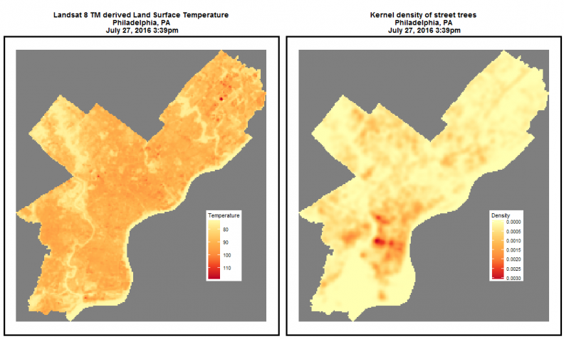
Land surface temperature and street tree density
It is clear that the density of street trees is at its greatest in Center City and neighborhoods on the periphery including West Philadelphia. Note that because these are street trees, the data reports very low densities in Fairmount Park in the City’s northwest. The land surface temperature map shows relatively cool temps in these parts.
What this suggests is that because the street tree data is not a complete tree census, the correlation between land surface temperature and street trees is likely not as strong as we would imagine in reality. While statistically significant, the correlation is minimal at 0.31
Nevertheless, we can build some very exploratory regressions that attempt estimate the street tree effect on temperature by controlling for a host of other built environment characteristics like parks.
Regressions: Land surface temperature as a function of street tree density & controls
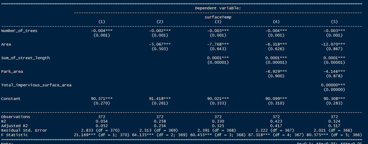
Here we aggregate the data to census tracts and regress average land surface temperature progressively on tract area (sq. mi.), sum of street length (ft.), park area (sq. mi.) and total impervious surface (sq. ft.).
This combination of explanatory variables explain as much as 52% of the variation in temps, estimating that on average, for an additional 100 trees in a census tract, land surface temperature decreases 0.3 degrees.
This is kind of a trivial exercise – we’ve already discovered the importance of roof color and size, but the data doesn’t exist to control for it in our model.
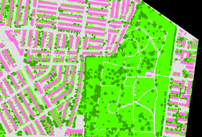
It is worth mentioning however, that there are two approaches that would really help us explore the statistical relationship between trees and urban heat islands in Philadelphia. The first is to use the City’s very high resolution dataset on tree canopy. Below, is a small portion of the dataset in the West Oak Lane neighborhood of Philadelphia.
Note the dark green is tree canopy. What makes this dataset so powerful is that it is at a 1 ft. resolution. Not surprisingly, it was also created using satellite imagery.
The street canopy dataset would give us a true tree census. The next compliment to this analysis would include some form of variation that would allow us to observe what would have happened to temperatures in an area had we not planted a tree.
One great avenue to generate a quasi-experimental setting would be to use data from TreePhilly, a phenomenal program run by the City of Philadelphia that has thus far, given away and planted more than 15,000 trees Citywide.
We could use these data to compare temperature changes around areas that requested and planted a tree (treatment group) to areas that requested but never planted a tree (control group).
In response to continued climate change and sea-level rise, increased urban migration will require new city planning, environmental and public health interventions to lessen the urban heat island effect. As usual, data and spatial analytics can help us better allocate our resources and help ensure a cooler future for our cities.
Ken Steif, PhD is the founder of Urban Spatial. He is also the director of the Master of Urban Spatial Analytics program at the University of Pennsylvania. You can follow him on Twitter @KenSteif