Founder, Ken Steif, recently worked with one of his students, Andrew Renninger, to analyze data from SafeGraph, a provider of cell phone GPS-enabled, origin & destination data. The goal was to try understand how travel patterns shifted pre and post quarantine.
The entire exploration is about a ten minute read and can be accessed here.
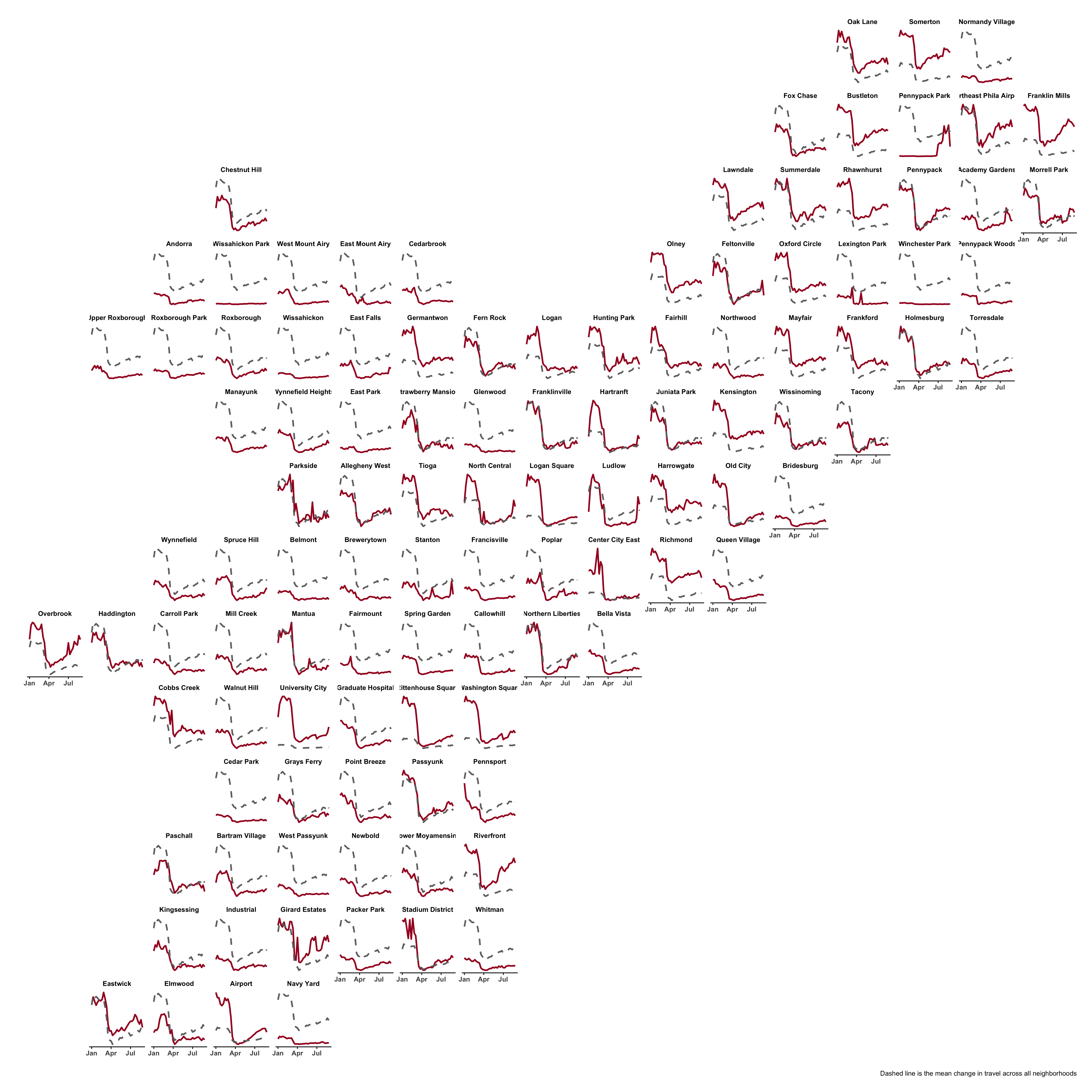
A couple quick visualizations below provide some important insights. The first visualizes a time series of neighborhood destinations compared to the Citywide trend. Areas with essential businesses, like big box stores, such as the Riverfront in South Philadelphia, saw massive spikes in visitation. Other areas, like Northern Liberties, a center of nighttime amenities, saw traffic plunge initially, but then trend upward, later in Summer 2020, as residents looked for places to be social.
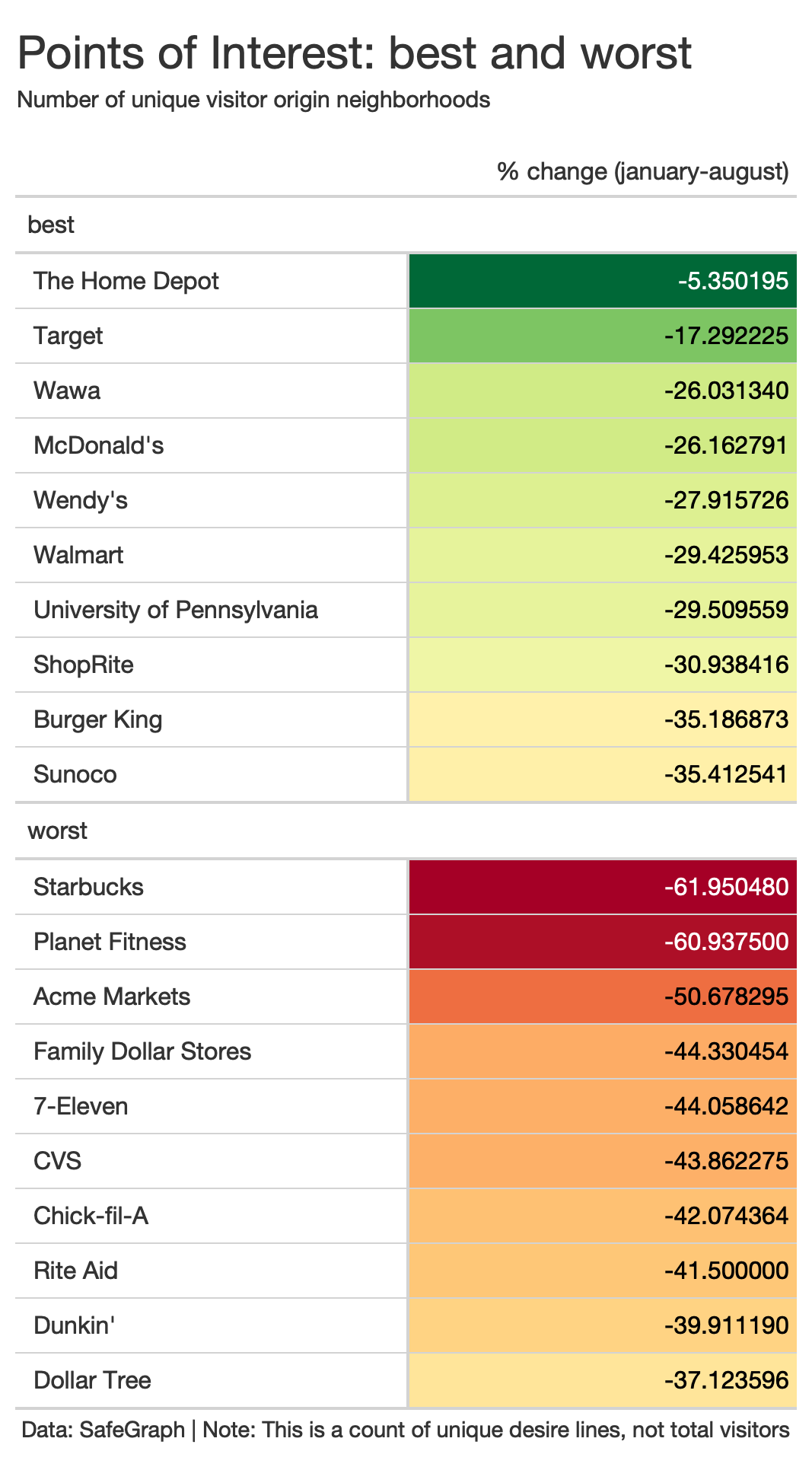
 The SafeGraph data attach Points of Interest (POI) on to many of the destinations, allowing one to understand which businesses were more or less resilient.

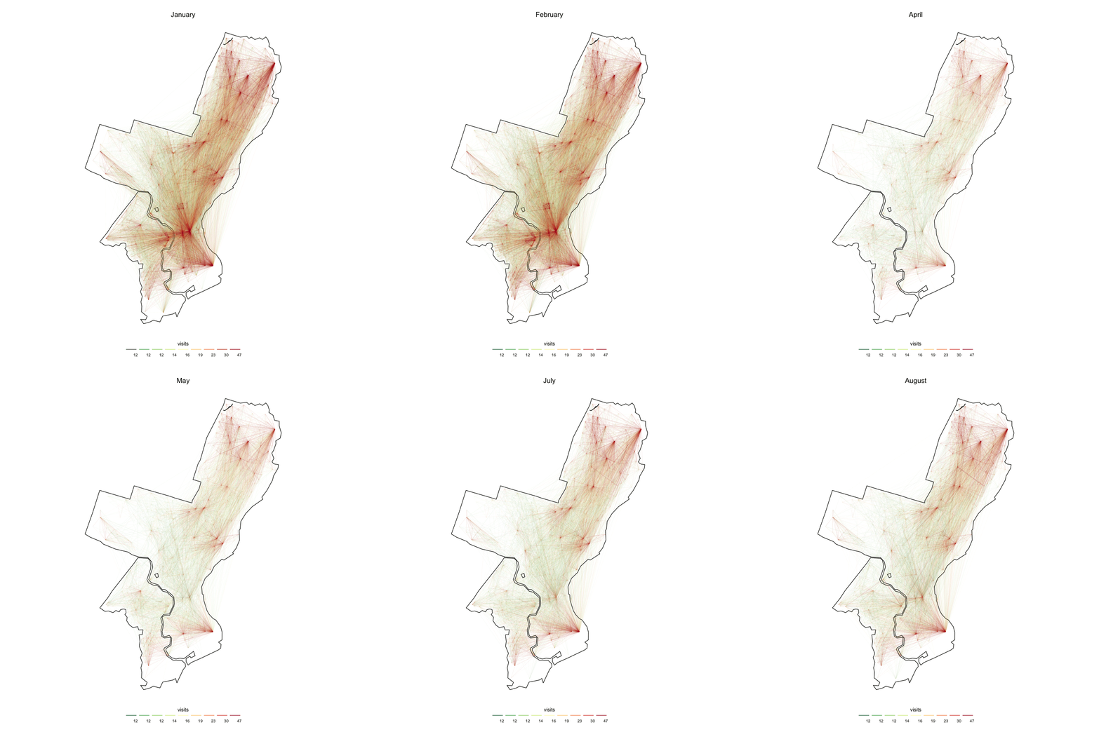
Finally, one can map the network interconnectedness of Philadelphia and see how the number of network connections plummeted following quarantine.

These data will be highly impactful for spatial data scientists in the future. The most important consideration for researchers who wish to use these data, is the sampling strategy that SafeGraph employs to ensure their sample of trips is representative.
Ken Steif, PhD is the founder of Urban Spatial. He is also the director of the Master of Urban Spatial Analytics program at the University of Pennsylvania. You can follow him on Twitter @KenSteif.
