Authors: Ken Steif, Alan Mallach, Michael Fichman, Simon Kassel
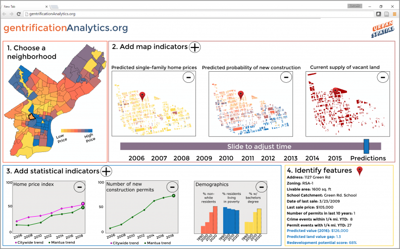
Figure 1: A mockup of a web-based, community-oriented gentrification forecasting application
Recently, the Urban Institute called for the creation of “neighborhood-level early warning and response systems that can help city leaders and community advocates get ahead of (neighborhood) changes.”
Open data and open-source analytics allows community stakeholders to mine data for actionable intelligence like never before.
The objective of this research is to take a first step in exploring the feasibility of forecasting neighborhood change using longitudinal census data in 29 Legacy Cities (Figure 2).
The first section provides some motivation for the analysis. Section 2 discusses the feature engineering and machine learning process. Section 3 provides results and the final section concludes with a discussion of community-oriented neighborhood change forecasting systems.
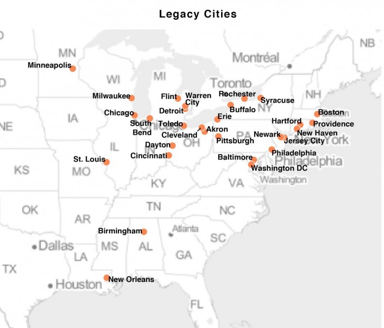
Figure 2: Legacy cities used in this analysis
Why forecast gentrification?
Neighborhoods change because people and capital are mobile and when new neighborhood demand emerges, incumbent residents rightfully worry about displacement.
Acknowledging these economic and social realities, policy makers have a responsibility balance economic development and equity. To that end, analytics can help us understand how the wave of reinvestment moves across space and time and how to pinpoint neighborhoods where active interventions are needed today in order to avoid negative outcomes in the future.
While the open data movement and open source software like Carto and R lower costs associated with community analytics, time series parcel-level data is expensive to collect, store and analyze.
Census data is ubiquitous however, and many non-profits are well-versed in technologies like the Census’ American FactFinder and The Reinvestment Fund’s PolicyMap. Thus, it seems reasonable to develop forecasts using these data before building comparable models using the more expensive, high resolution space/time home sale data.
The goal here is to use 1990 and 2000 Census data on home prices to predict home prices in 2010. If those models prove robust, we can use the model to forecast for 2020.
Endogenous gentrification
The key to our forecasting methodology is the conversion of Census tract data into useful ‘features’ or variables that help predict price. Our empirical approach is inspired by the theory of ‘endogenous gentrification’ – a theory of neighborhood change which suggests that low-priced neighborhoods adjacent to wealthy ones have the highest probability of gentrifying in the face of new housing demand.
Typically, urban residents trade off proximity to amenities with their willingness to pay for housing. Because areas in close proximity to the highest quality amenities are the least affordable, the theory suggests that gentrifiers will choose to live in an adjacent neighborhood within a reasonable distance of an amenity center but with lower housing costs.
As more residents move to the adjacent neighborhood, new amenities are generated and prices increase which means that at some point, the newest residents are going to settle in the next adjacent neighborhood and so on.
This space/time process resembles a wave of investment moving across the landscape. Our forecasting approach attempts to capture this wave by developing a series of spatially endogenous home price features.
The models attempt to trade off these micro-economic patterns with macro-economic trends that face many of the Legacy Cities in our sample. Principal among these is the Great Recession of the late 2000s. Of equal importance is the fact that gentrification affects only a small fraction of neighborhoods. As our previous research has demonstrated, neighborhood decline is still the predominant force in U.S. Legacy cities.
Featuring Engineering
Our dataset consists of 3,991 Census tracts in 29 Legacy Cities from 1990, 2000 and 2010. The data originates from the Neighborhood Change Database (NCDB) which standardizes previous Decennial Census surveys into 2010 geographical boundaries allowing for repeated measurements for comparable neighborhoods over time.
While standardizing tract geographies over time is certainly convenient, it does not account for the ecological fallacy nor deal with the fact that tracts rarely comprise actual real estate submarkets.
Figure 3 plots the distribution of Median Owner-Occupied Housing Value for 1990, 2000 & 2010 for the 29 cities in our sample. There is no clear global price trend in our sample. Some cities see price increases, some see decreases and others don’t change at all.
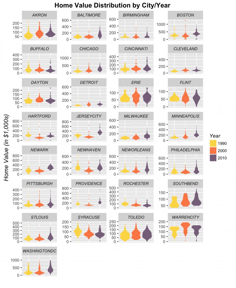
Figure 3: Median Owner-Occupied Housing Value by city
Between census variables and those of our own creation, our dataset consists of nearly 200 features or variables that we use to predict price. We develop standard census demographic features as well endogenous features that explain price as a function of nearby prices and other economic indicators like income. There are three main statistical approaches we take to develop these features.
The simplest of our endogenous price features is the ‘spatial lag’, which for any given census tract is the simply the average price of tracts that surround it (Figure 4). Figure 5 shows the correlation between the spatial lag and price for the cities in our sample.
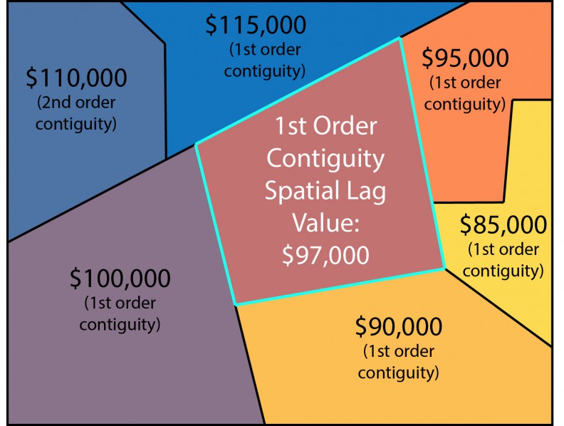
Figure 4: The spatial lag
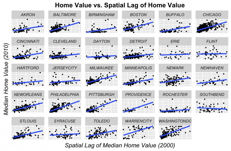
Figure 5: Price as a function of spatial lag
Our second endogenous price feature is one which measures proximity to high-cost areas. Here we create an indicator for the highest priced and highest income tracts for each city in each time period and calculate the average distance in feet from each tract to its n nearest 5th quintile neighbors in the previous time period. The motivation here is to capture emerging demand in the ‘next adjacent’ neighborhood over time (Figure 6). Figure 7 shows the correlation with price.
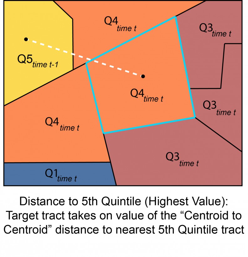
Figure 6: Distance to highest value tract in the previous time period
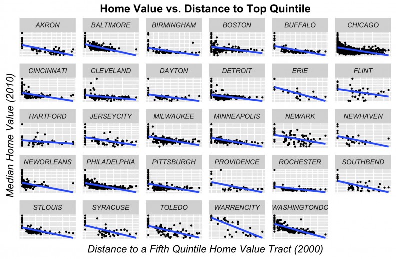
Figure 7: Price as a function of its distance to highest value tract in the previous time period
Our third endogenous price predictor attempts to capture the local spatial pattern of prices for a tract and its adjacent neighbors. As previously mentioned, to be robust, our algorithm must trade-off global trends with local neighborhood conditions. There are three local spatial patterns of home prices that we are interested in: clustering of high prices; clustering of low prices; and spatial randomness of prices.
Local clustering of high and low prices suggests that housing market agents agree on equilibrium prices in a given neighborhood. Local randomness we argue, is indicative of a changing neighborhood – one that is out of equilibrium.
A similar approach was used for a previous project, predicting vacant land prices in Philadelphia.
In a changing neighborhood, buyers and sellers are unable to predict the value of future amenities. Our theory argues that when this uncertainty is capitalized into prices, the result is a heterogeneous pattern of prices across space. Capturing this spatial trend is crucial for forecasting neighborhood change.
To do so we develop a continuous variant of the one-sided Local Moran’s I statistic. Assume that the dots in Figure 8 below represent home sale prices for houses or tracts. The homogeneous prices in the left panel are indicative of an area in equilibrium where all housing market agents agree on future expectations. Our Local Moran’s I feature of this area would indicate relative clustering.
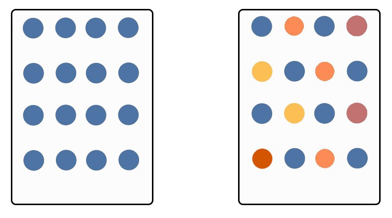
Figure 8: Equilibrium and disequilibrium markets
Conversely, the panel on the right with more heterogeneous prices, is more indicative of a neighborhood in flux – one where housing market agents are capitalizing an uncertain future into prices. In this case, the Local Moran’s I feature would indicate a spatial pattern closer to randomness.
We find this correlation in many of the cities in our sample as illustrated in Figure 9.
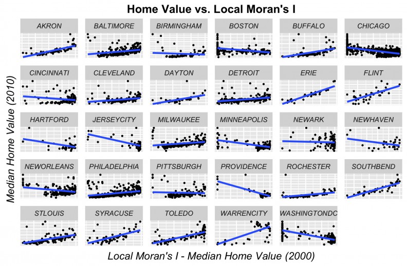
Figure 9: Price as a function of the Local Moran’s I p-value
Results
A great deal of time was spent on feature engineering and feature selection. We employ four primary machine learning algorithms, Ordinary Least Squares (OLS), Gradient Boosting Machines (GBM), Random Forests, and an ensembling approach that combines all three. You can find more information on these models in our paper which is linked below.
Our models are deeply dependent on cross-validation, ensuring that goodness of fit is based on data that the model has not seen.
Although we estimate hundreds of models, Table 1 presents (out of sample) goodness of fit metrics for our four best – each an example of one of the four predictive algorithms.
The “MAPE” or mean absolute percentage error, is the absolute value of the average error (the difference between observed and predicted prices by tract) represented as a percentage which allows for a more consistent way to describe model error across cities.
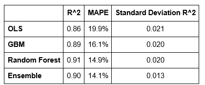
Table 1: Goodness of fit metrics for four models
The Standard Deviation of R-Squared measures over-prediction. Using cross-validation, each time the model is estimated with another set of randomly drawn observations, we can record goodness of fit. If the model is truly generalizable to the variation in our Legacy City sample, then we should expect consistent goodness of fit across each permutation.
If the model is inconsistent across each permutation, it may be that the goodness of fit is driven solely by individual observations drawn at random. This latter outcome might indicate overfitting. Thus, this metric collects R^2 statistics for each random permutation and then uses standard deviation to assess whether the variation in goodness of fit across each permutation is small (ie. generalizability) or a large (ie. overfitting).
Figure 10 shows the predicted prices as a function of observed prices for all tracts in the sample. If predictions were perfect, we would expect the below scatterplots to look like straight lines. The obvious deviation from would-be straight lines is much greater for the OLS and GBM models then for the random forest and stacked ensemble models. These models loose predictive power for higher priced tracts.
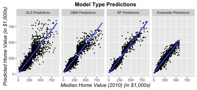
Figure 10: Predicted prices as a function of observed prices for all tracts
Figures 11-14 display observed vs. predicted prices by city for each of the predictive algorithms. Again, OLS and Random Forests loose predictive power for high priced tracts. However, when predictions are displayed in this way, the GBM and Ensemble predictions appear quite robust for most of the cities.
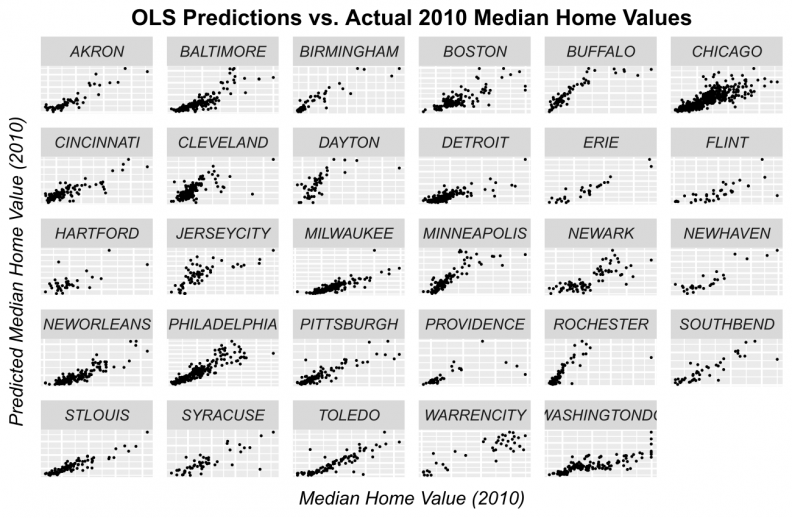
Figure 11: OLS predicted prices as a function of observed prices for tracts by city
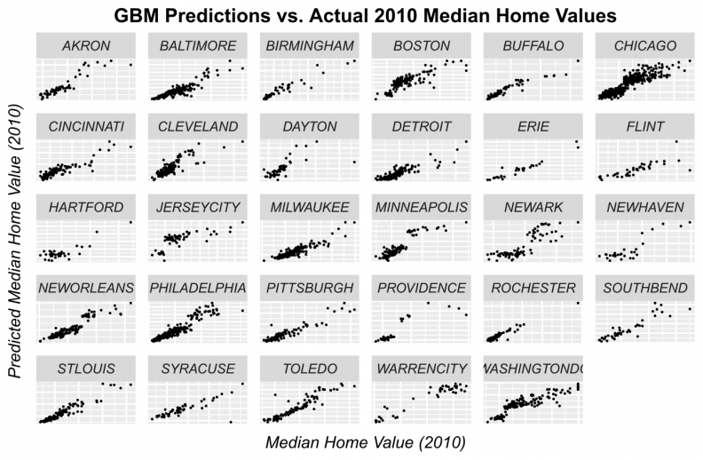
Figure 12: GBM predicted prices as a function of observed prices for tracts by city
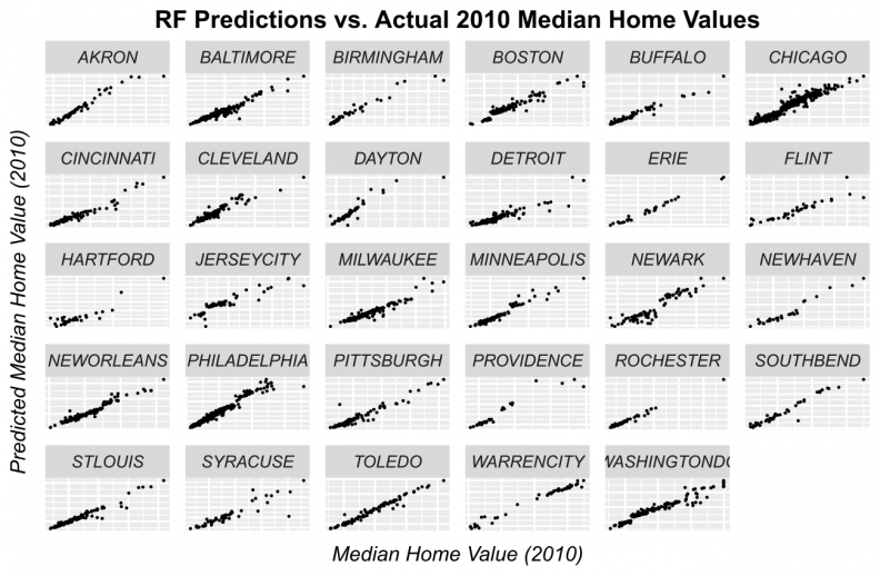
Figure 13: Random Forest predicted prices as a function of observed prices by city
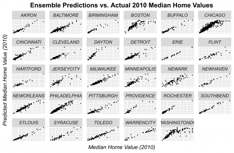
Figure 14: Ensemble predicted prices as a function of observed prices by city
Finally, Figures 15 and 16 display the MAPE (error on a percentage basis) by City in bar chart and map form respectively. The highest error rates that we observe at the city-level is around 13.5% and the smallest is around 4%. One important trend to note is that we achieve ~8% errors for many of the larger, post-industrial cities. In addition, it does not seem as though there is an observable city-by-city pattern in error. That is, the model is not biased toward smaller cities or larger ones or those with booming economies. This is evidence that our final model is generalizable to a variety of urban contexts.
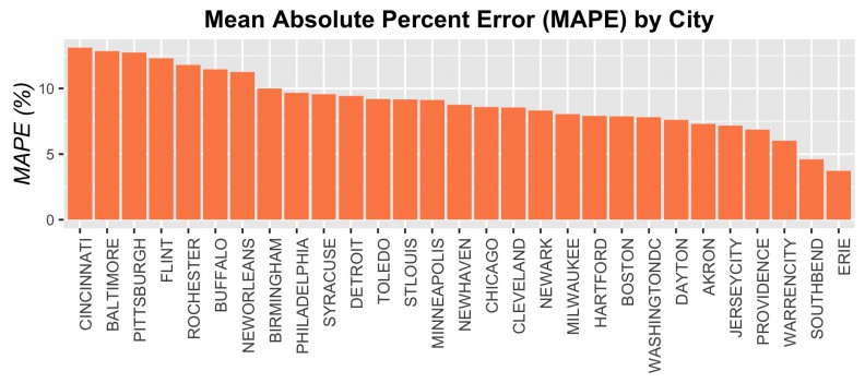
Figure 15: MAPE by City
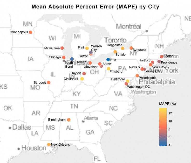
Figure 16: MAPE by City in map form
Finally, Figure 17 illustrates for Chicago, the 2010 predictions generated for each of the four algorithms along with the observed 2010 median owner-occupied home prices.
Despite the stacked ensemble predictions having the lowest amount of error, it still appears to underfit for the highest valued tracts (Panel 4, Figure 17). This occurs for three reasons. First, the census data is artificially capped at $1 million dollars which creates artificial outlying “spikes” in the data, that, despite our best efforts, we were unable to model in the feature engineering process.
Second, as previously mentioned, the predominant pattern over time is decline not gentrification. Thus, it is difficult for the model, at least in Chicago, to separate a very local phenomenon like gentrification, from a more global phenomenon like decline. Because all cities are modeled simultaneously, these predictions are also weighted not only by the Chicago trend, but by the trend throughout the sample.
Finally, and this is probably the most important issue, our time serious has just two preceding time periods to use as predictors while neighborhood trajectories are clearly more fluid.
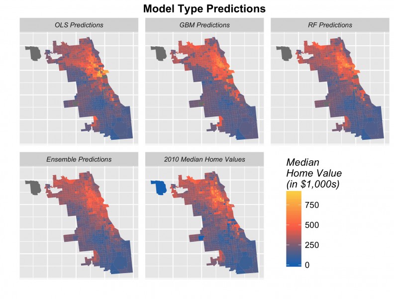
Figure 17: Predicted prices for four algorithms and observed 2010 prices, Chicago
The implications of this under-prediction in cities like Chicago is that our forecasts in these cities will also under-predict. While we choose to illustrate Chicago, many cities do not in fact under-predict. This is evident in their 2020 forecasts as seen in Figure 18 below.
The next step is to rerun our models using 2000 and 2010 to forecast for 2020. Figure 18 shows the results of these forecasts in barplot form by city, alongside observed 1990, 2000 and 2010 prices. Many cities including Baltimore, Chicago, Cleveland, Detroit, Minneapolis, Newark, Philadelphia, show a marginal increase in price forecasts for 2020. Others, such as Baltimore, Boston, Jersey City and Washington D.C. do not, despite the fact that anecdotally, we might expect them to. Figure 19 shows tract-level predictions for three cities.
With this under-prediction notwithstanding, we still are quite pleased with how much predictive power we could mine from these data. As we discuss below, there is a real upside to replicating this model on sales-level data.
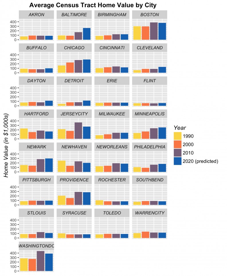
Figure 18: Time series trend with predictions by City
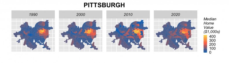
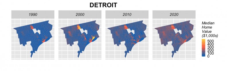
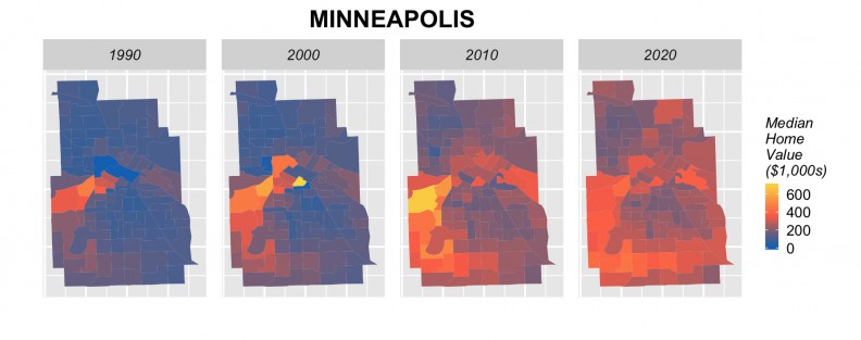
Figure 19: Tract-level forecasts in 3 cities
Next steps
It appears that endogenous spatial features combined with modern machine learning algorithms can help predict home prices in American Legacy Cities using longitudinal census data – with caveats as mentioned above.
As previous work has shown however, this approach is really powerful when using parcel-level time series sales data.
This insight motivates what we think are some important next steps with respect to the development of neighborhood change early warning systems.
First, check out this phenomenal paper recently published in HUD’s Cityscape journal entitled “Forewarned: The Use of Neighborhood Early Warning Systems for Gentrification & Displacement” by Karen Chapple and Mariam Zuk.
The authors raise two important points. The first, is that existing early warning systems are not doing a great job on the predictive analytics side. We think that many of these deficiencies could be addressed as more Planners become versed in machine learning techniques including how to build useful features like the endogeneous gentrification variables described above.
The second critical point that Chapple and Zuk raise is that “Little is understood, however, about precisely how stakeholders are using the systems and what impact those systems have on policy.” A UX/UI engineer might restate this question by asking, “What are the use cases? Why would someone use such a system?”
The point is that no matter how well the model performs, if insights cannot be converted in to equity and real policy, then predictive accuracy is meaningless.
Here are some suggestions about how the next generation of forecasting tools could look:
Figure 20: An example of a gentrification early warning system using event-based forecasts
Instead of modeling data for 29 cities at once, consider a model built for one city, using consecutive years of parcel-level data.
Second, alongside a continuous outcome like price, consider modeling a series of development-related events like new construction permits, rehab permits and evictions. Event-based forecasting could for instance, predict the probability of (re)development for each parcel citywide.
These probabilities could help the government and non-profit sectors better allocate their limited resources. This helps us get a better sense of the most appropriate use cases, like, “Where should build our next affordable housing development?”
A tool, like the one shown in Figure 20 would allow equity-driven organizations to strategically plan future development and redevelopment opportunities as well as better manage the existing stock of affordable housing in the neighborhood. It would also help state finance agencies better target tax credits, and aid planning and zoning boards to better understand the effect that zoning variances might have on future development patterns.
If one were to combine these predictive price and event-based algorithms into one information system, fueled predominately by preexisting city-level open data, the potential value-added for community organizations, government and grant-making institutions would be immense.
Conclusion
This report experimented with using longitudinal census to predict home prices in 29 American Legacy cities. Our motivation was that if we could develop a robust model, the results could help community stakeholders better allocate their limited resources.
Our training models use 1990 and 2000 data to predict for 2010 yielding an average prediction error of just 14% across all tracts. When this error is considered on a city-by-city basis, the median error is around 8%. It is important to note that our endogenous feature approach does not overfit the model. We think these results are admirable given the limitations of our time series; that our unit of analysis, census tracts, rarely if ever conform to true real estate submarkets and that neighborhood decline is still the predominate dynamics in these Legacy Cities. The greatest weakness of our model is that the limited time series is the likely driver for under-prediction in some cities, which affects our 2020 forecasts.
Our major methodological contribution is the adoption of endogenous gentrification theory in the development of spatial features that are effective for predicting prices in a machine learning context without overfitting.
We believe that this approach can and should be extended to parcel data, using both continuous outcomes like prices, and event-based outcomes like development. These algorithms and technological innovations such as the information system described above, can play a pivotal role in how community stakeholders allocate their limited resources across space.
Ken Steif, PhD is the founder of Urban Spatial. He is also the director of the Master of Urban Spatial Analytics program at the University of Pennsylvania. You can follow him on Twitter @KenSteif.
The full report can be downloaded here.
This work was generously supported by Alan Mallach and the Center for Community Progress. This is the second of two neighborhood change research reports – here is the first.