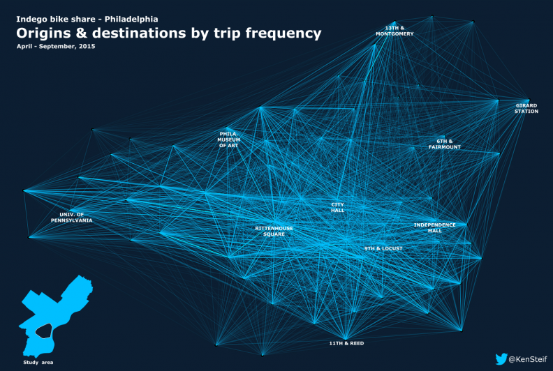
Ever since Mike Batty and team at UCL’s Centre for Advanced Spatial Analysis showcased their project using London’s Oyster Card subway system origin and destination (OD) data, there’s been a deluge of open OD data out there. I’ve converted several of these datasets into data visualizations in the past and today I’m adding a new one to the list – OD trip frequency from the first six months of Philadelphia’s Indego bike share system.
Many thanks to the Mayor’s Office of Transportation & Utilities and RideIndego for putting the data up on OpenDataPhilly. It gave me the opportunity to replicate one of my favorite recent data visualizations – James Cheshire’s Journey to work visualization around London.
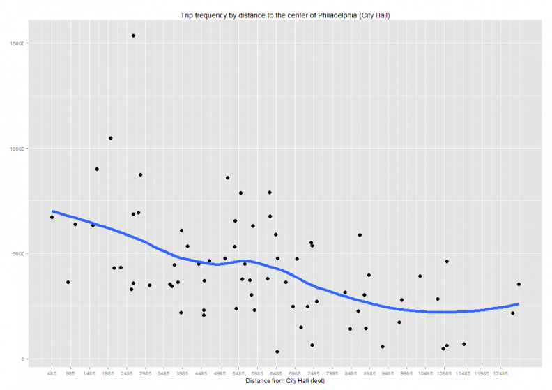
There’s obviously a great deal of variation in bike share flows across Philadelphia which makes the above data viz a bit tricky to comprehend. However, the observant reader will notice some interesting patterns. There is a clear preference for east/west trip flows. In addition, although it’s probably not much of surprise given Philly’s moncentric structure, the plot below further illustrates how trip frequency falls with distance from Center City. By the way, that one outlier at about 2500 feet and greater than 15k trips is in fact Rittenhouse Square – Indego’s gravitational center.