It’s not actionable intelligence if the results cannot be translated in to a useful narrative. Data visualization is an important strategy for conveying technical analysis to non-technical decision makers.
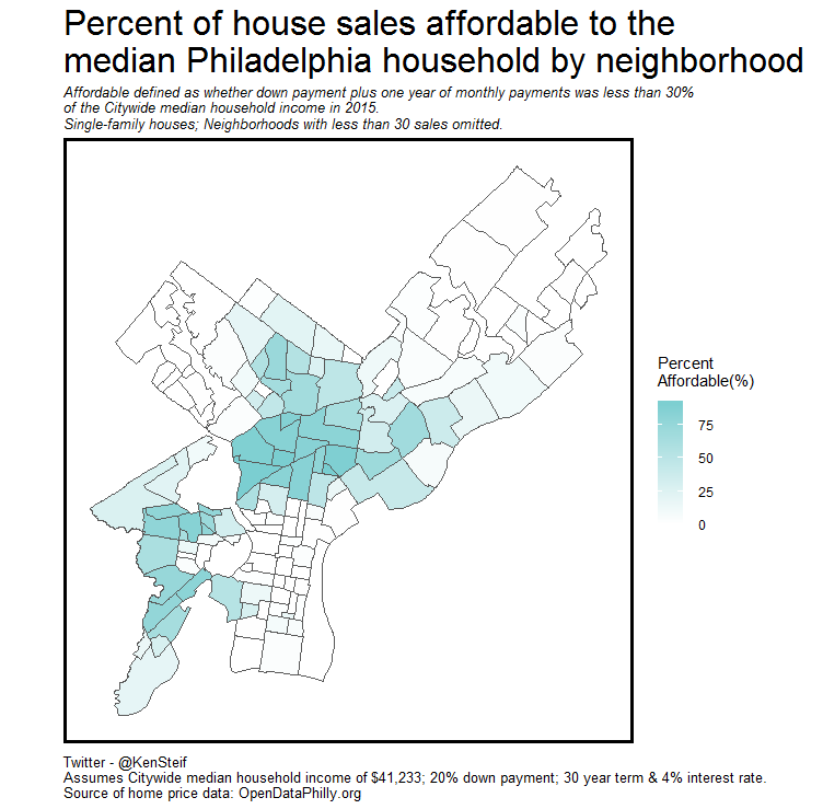
We created this dataviz that shows the percent of single-family home sales that the median Philadelphia home buyer could afford. It is striking how difficult it is for the median Phladelphian to move into a neighborhood of opportunity.
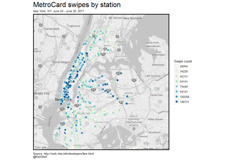
New York City’s MTA made some open data available which we used to create this map. In order to geo-locate the stations, we fed the station names in to the Google geocoder by way of the ggmap package.
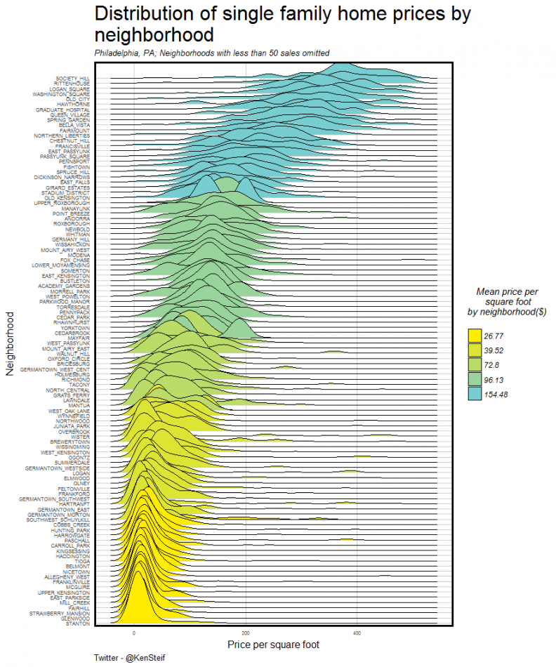
Joy Plots are all the rage right now. It does provide an interesting take on phenomena we deal everyday at Urban Spatial.
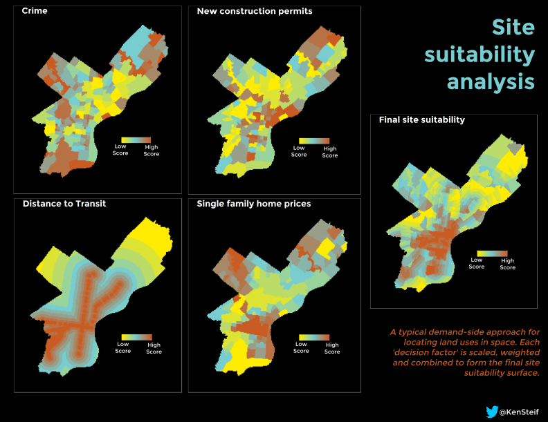
We put this together to explain explain how a basic weighted raster overlay analysis works.
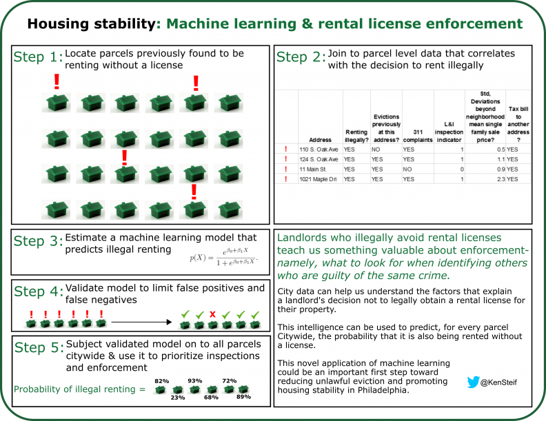
We created this little infographic to describe in simple terms, how machine learning could be used to predict landlords in Philadelphia renting without a license.

Always on the look out for new color ramps.
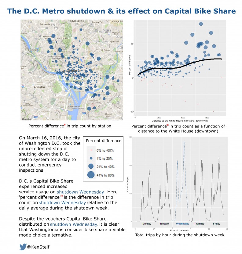
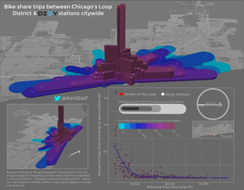
Sudden policy changes like the D.C. metro system shutdown of March, 2016 provide a really great opportunity to estimate some quasi-experimental effects. This data visualization looks at the effect on bike share use.
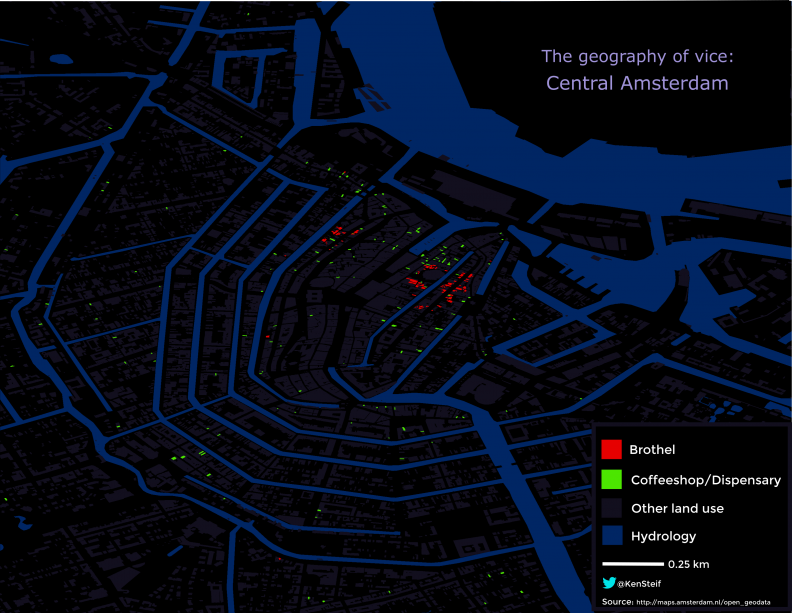
Turns out Amsterdam has a wealth of open data. It is always interesting to consider why some phenomena cluster in space while others do not.
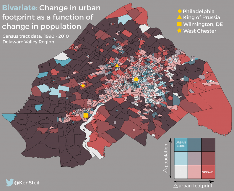
The above data visualization attempts to map two variables simultaneously – change in urban footprint (from satellite imagery) and change in population. These maps are typically referred to as ‘bivariate choropleth maps”. The legend at the bottom right helps the reader understand the direction of correlation. We see that many exurban areas around Philadelphia exhibited smart growth over the last 30 years. In addition, while the City’s urban core has grown, it appears as though inner-ring suburbs have been relatively stagnant. Click here for a larger image.
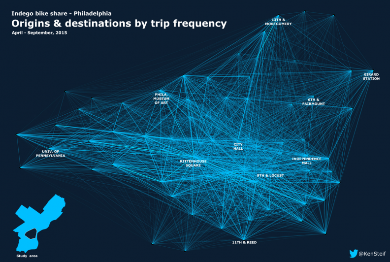
To learn more about this bike share data viz, check out this brief write-up.
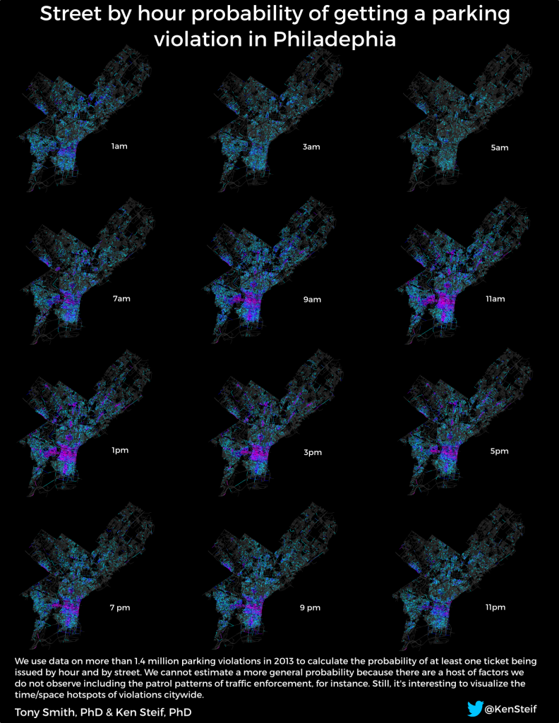
The City of Philadelphia released millions of geocoded parking violations. Dr. Tony Smith and I thought it would be interesting to explore how certain parking violation hotspots wax an wane over time and space. Here is a gallery with larger, hourly maps.
Bike share data has origin and destination, which makes it challenging
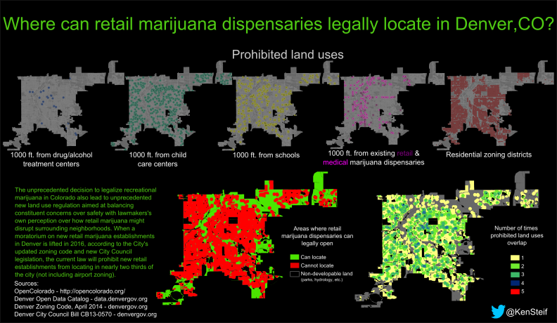
Marijuana reform is generating all sorts of interesting economic spillovers. Given that the location of dispensaries are restricted by local zoning laws, spillovers will also be generated in land markets as well. The above data viz illustrates where Denver zoning laws permit marijuana dispensaries across the cities.
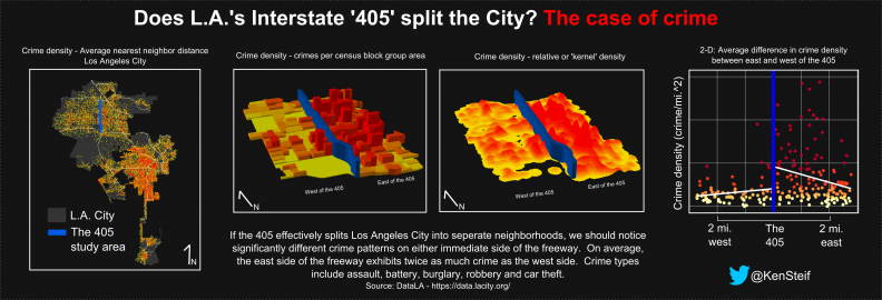
Geographers are always interested in boundaries. Here is a longer write up about this data viz on Los Angeles’ 405 splitting the neighborhood in two.
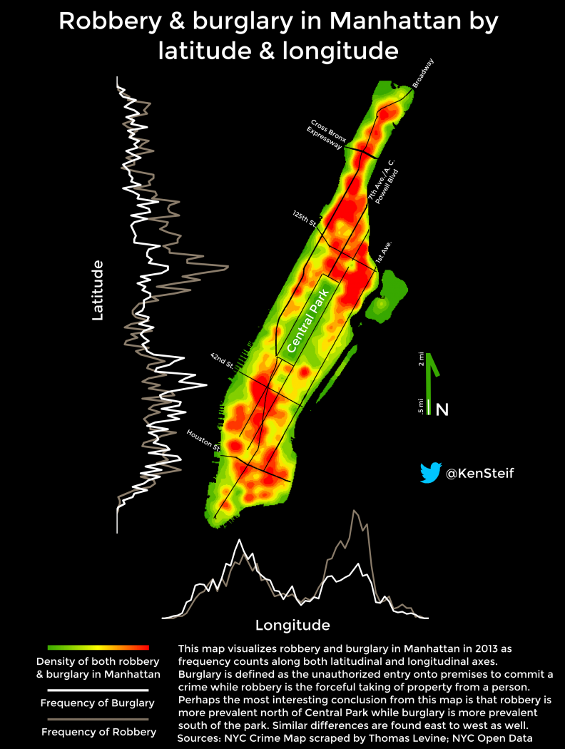
An alternate take on crime mapping.
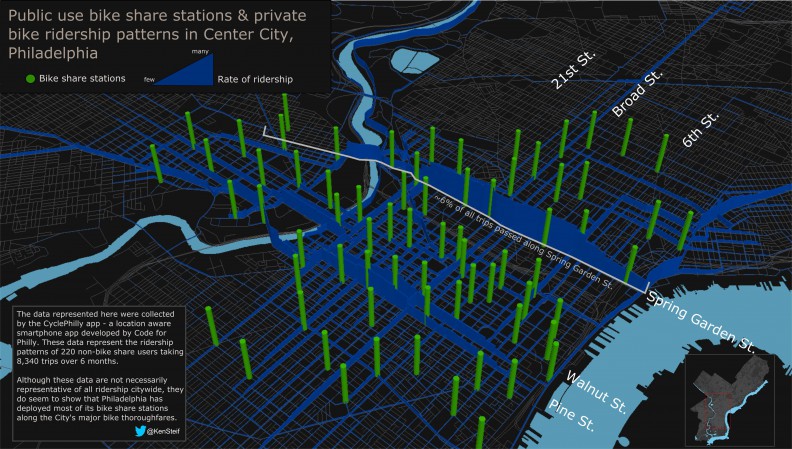
While most bike share data includes just origins and destinations, the CyclePhilly data includes route information as well.
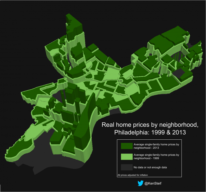
This image attempts to visualize change in home prices by neighborhood over two time periods using just one map.
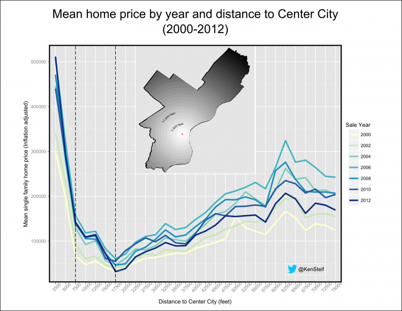
This data visualization tells two stories. The first is that home prices in Philadelphia decrease dramatically with distance from the City’s central business district. The second story is that home prices were not as resilient to the 2008 recession as they were downtown.
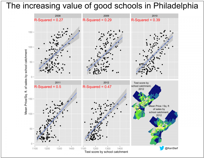
An attempt to combine small multiple charts with a map.
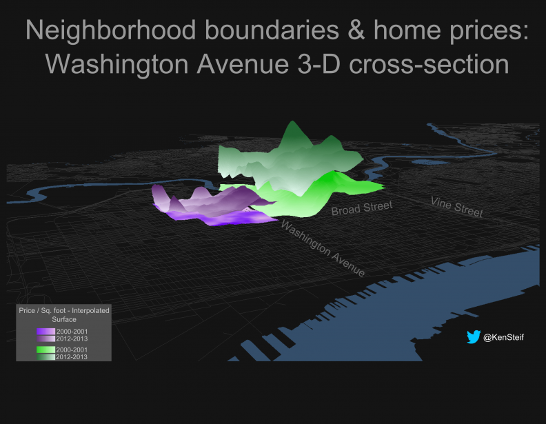
Assuming Washington Avenue is a boundary between two neighborhoods, this visualization attempts to show its waning significance for two time periods using a 3-D view.
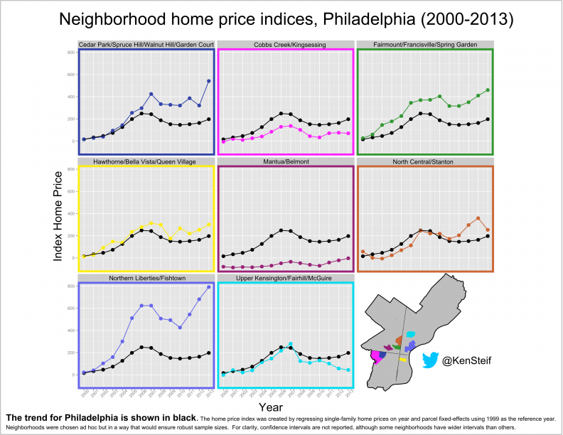
Another example pairing small multiples with a map. Here we compare neighborhood home price trends to citywide trends.
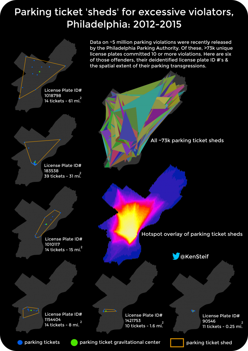
Another attempt at boiling down millions of parking violations into a more manageable data viz.
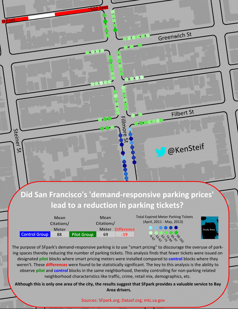
Using data from the SFPark Experiment. Check out this write up for more info.
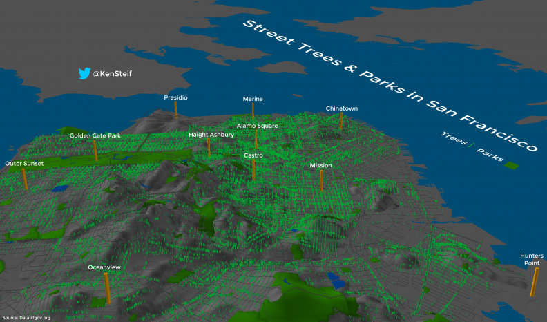
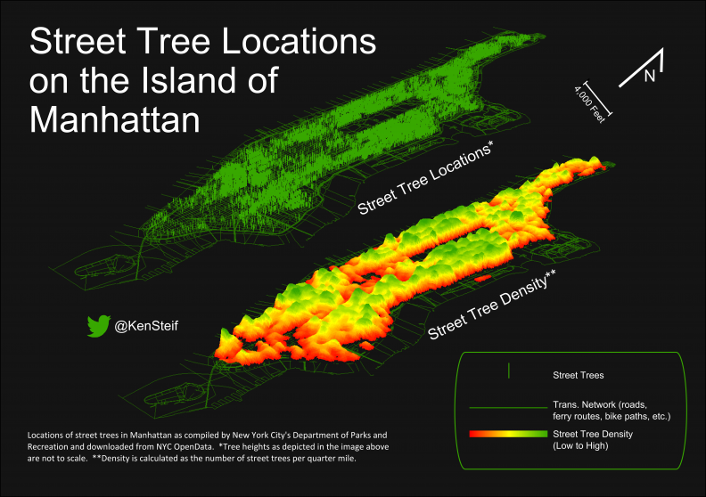
The above two images make use of the growing number of street tree datasets in cities nationwide.
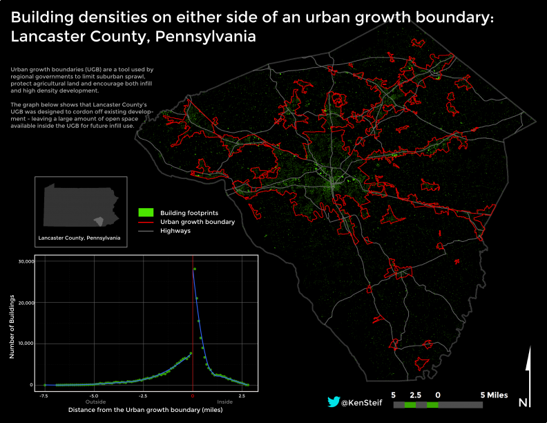
Some urban planning work from Lancaster County, Pa.
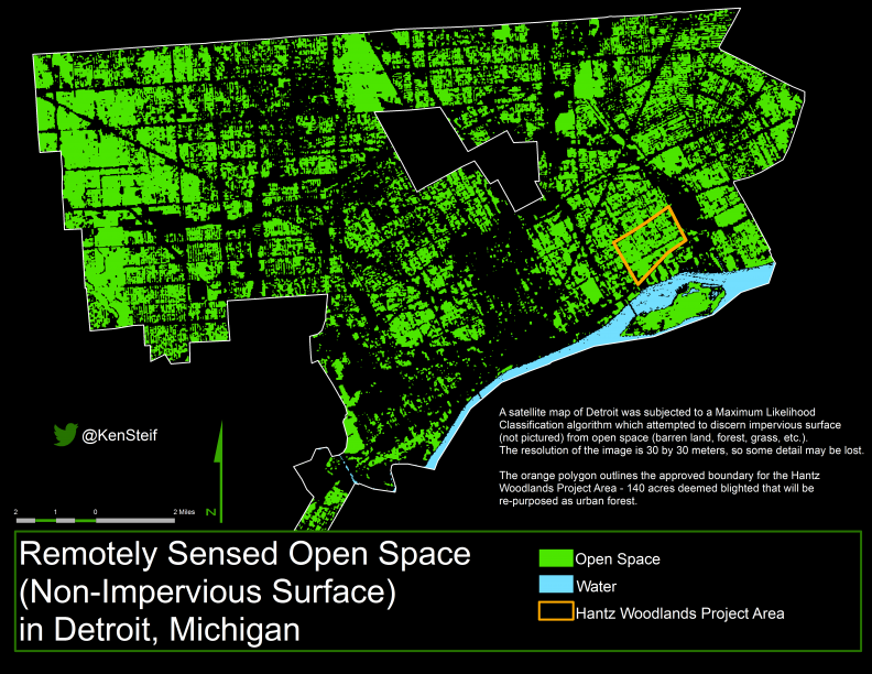
An example of satellite remote sensing from Detroit.
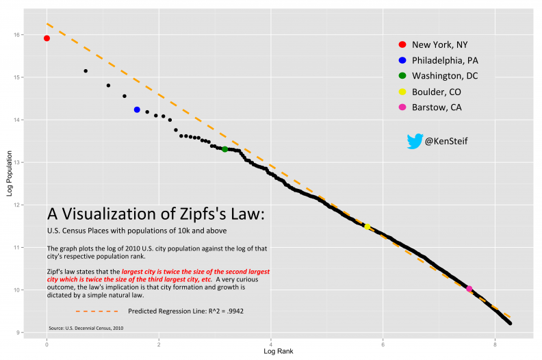
There are a surprising number of domains that Zipf’s law applies to including cities.