Authors: Dennis Culhane, Vincent Reina, Ken Steif
Subsidized housing is an invaluable Integrated Data use case because of its association with a host of important socioeconomic outcomes.
A prime example is a project completed with colleagues at the University of Pennsylvania, where we use integrated data to develop a baseline evaluation of the Philadelphia Housing Authority’s (PHA) Sharswood neighborhood intervention.
The analysis we describe here provides unprecedented insight into the subsidized housing community in both North Philadelphia’s Sharswood neighborhood and the City as a whole.
The next section provides some context for our analysis and discusses our data. The section to follow describes the research design and results. The final section concludes.
The Sharswood neighborhood intervention
The Sharswood neighborhood in North Philadelphia has a rich history, but like many post-industrial neighborhoods, Sharswood fell into alarming disrepair. According to American Community Survey estimates, the neighborhood had a 2014 poverty rate of 56% – more than twice that of Philadelphia (26.7%).
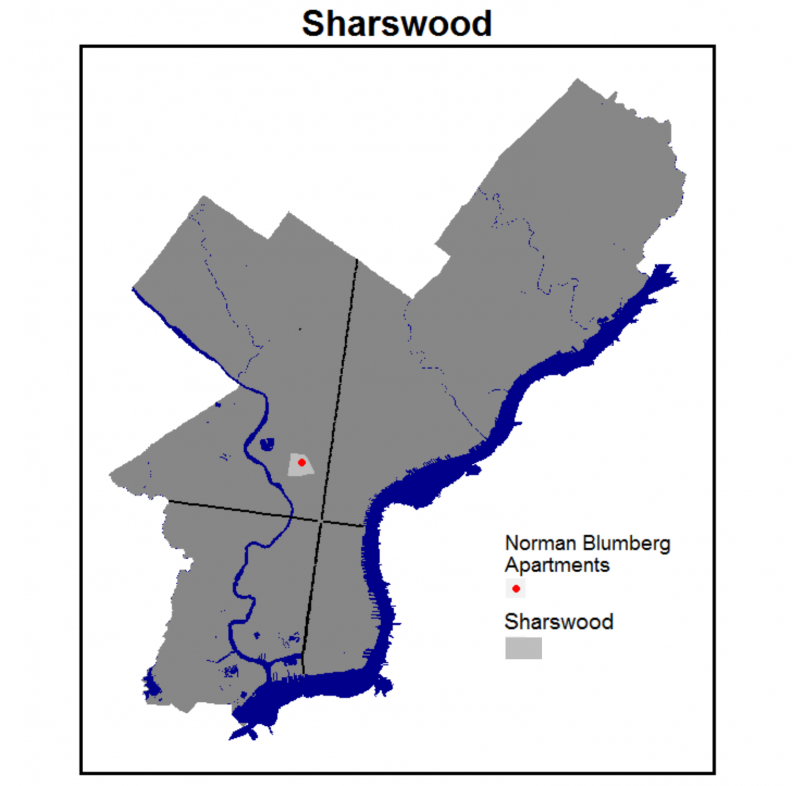
Figure 1: The Sharswood neighborhood
By the 1990’s planners and sociologists had gathered enough evidence from around the country to conclude that high-rise public housing like Sharswood’s Norman Blumberg Apartments concentrated poverty at such massive scales that in order to break cycles of intergenerational poverty, cities had to replace these structures with lower density housing and more demand-side subsidies.
Housing policy has since advocated for ‘mixed-income’ neighborhoods based on the belief that neighborhood is more than just a manifestation of the built environment but the social, behavioral and economic context in which individuals interact with each other.
This is the motivation for PHA’s plan to demolish the Norman Blumberg Apartments and replace them with 1,200 units of affordable rental and owner-occupied housing. The plan also calls for the revitalization of the Ridge Avenue commercial corridor; the development of a new school; and for PHA to relocate its headquarters to the neighborhood.
Demolitions and relocation began in early 2016.
While critics compare this large-scale intervention to the Urban Renewal projects of the 1950s and 1960s, there are some important innovations in PHA’s plan – namely, a proposal to bolster neighborhood school quality.
Research shows us that “exposure to better neighborhoods” (defined in part, by school quality) improves a host of outcomes including college attendance and adult earnings.
The emerging belief among scholars, is that human capital development alongside housing and economic development can help generate more productive ‘neighborhood effects’ and ultimately help incumbent residents achieve greater income mobility.
Motivated by this assertion, the goal of our evaluation as illustrated in Figure 2, is to disrupt a feedback process whereby disadvantaged neighborhoods generate low-quality neighborhood effects leading to high poverty rates and the status quo. While the intervention is just getting underway, our hypothesis is that PHA’s ‘comprehensive neighborhood intervention will generate improved outcomes and lower poverty rates.
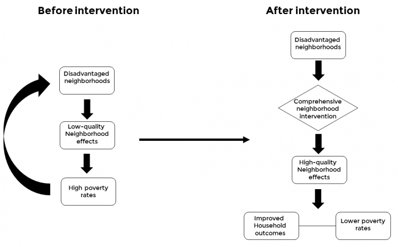
Figure 2: Logic model of our main hypothesis
The data
With the help of PHA and Philadelphia’s Data Management Office, we use a novel administrative dataset featuring de-identified data on every subsidized housing resident in the City (n = ~75,000). The privacy of these data are heavily regulated by Federal law such that not only are the data stripped of identifiers, they are also masked in instances where small sub-sample sizes threaten reidentification when combined with external open data sources.
Because neighborhood effects so many aspects of an individual’s life, we collect as many important variables as possible – some as outcomes and others as controls. Figure 3 gives a description of the data. Note that our data are relevant for families, adults and children.
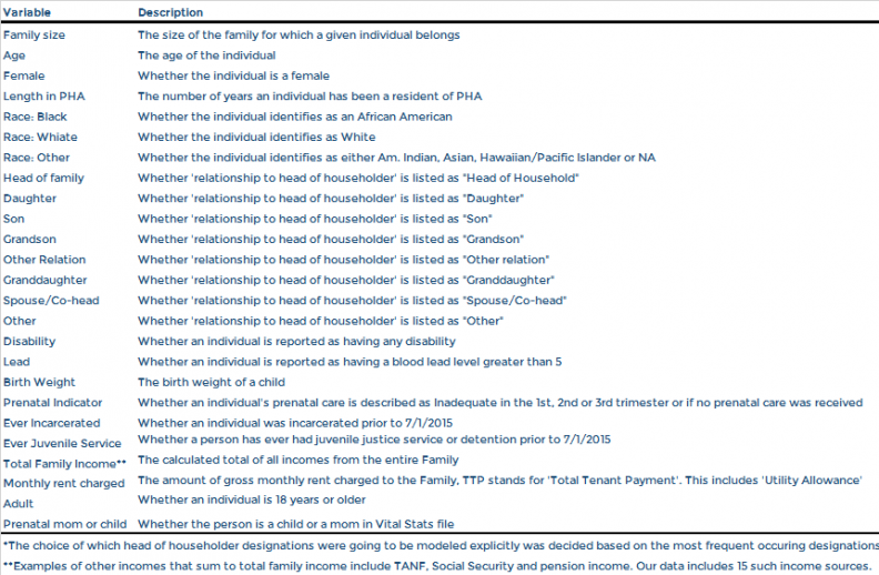
Figure 3: Variable descriptions
We can also capture some very interesting trends from these data. Figures 4, 5 and 6 show the proportion of residents by race, age and number of dependents both for Sharswood and for all PHA properties, respectively.
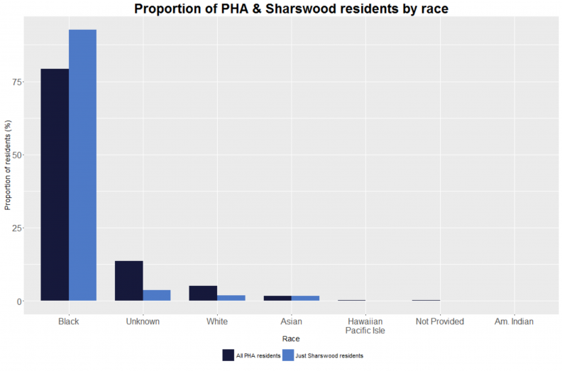
Figure 4: Race breakdown
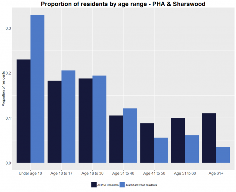
Figure 5: Age breakdown
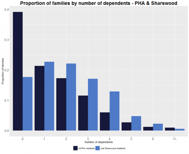
Figure 6: Number of dependents breakdown
It is clear that there were more African Americans in Sharswood then in PHA properties as a whole, and that Sharswood residents were on average, younger reflected both in the age distribution and in the number of dependents by household.
We can also look at where Sharswood residents were relocated to. Figure 7 shows the proportion of Sharswood residents who relocated into a given type of subsidized housing. The figure compares these rates to the overall distribution of subsidized housing types for all PHA residents.

Figure 7: Where Sharswood residents were relocated to by housing type
While just over 50% of PHA residents hold housing vouchers, only 29% of relocated Sharswood residents took vouchers when leaving Sharswood. Figure 8 maps the density of PHA residents Citywide and Figure 9 maps the density of where Sharswood residents were relocated to. Many residents understandably chose to remain in the community.
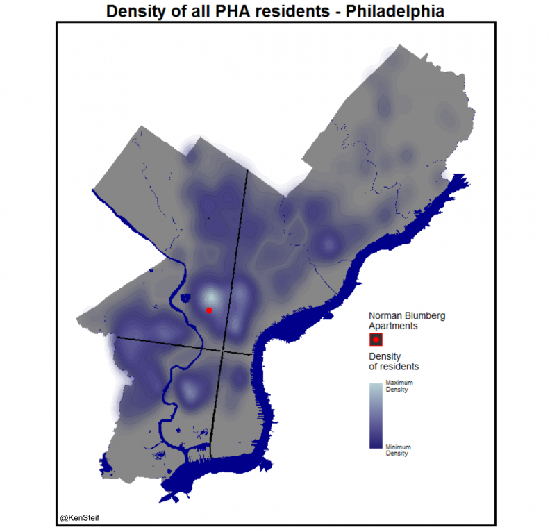
Figure 8: Density of PHA residents in Philadelphia
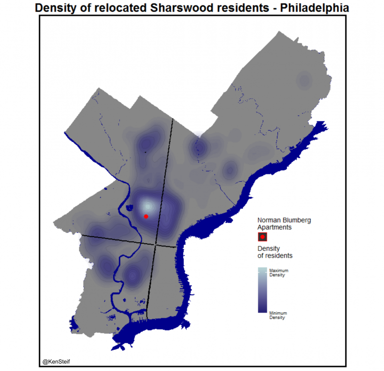
Figure 9: Density of relocated Sharswood residents in Philadelphia
We present several additional indicators in the Appendix below.
Research design & baseline results
Our research design estimates differences in outcomes for residents displaced from Sharswood to outcomes for comparable residents that did not. The paper elaborates on the quasi-experimental limitations of the design, but in short, our goal is to match the 1,1110 residents in the Sharswood ‘treatment group’ with a cohort of non-Sharswood subsidized housing residents – the ‘control group’.
Given that the new development will be built incrementally, our research design is longitudinal. Figure 10 illustrates how the research design operationalizes the hypothesis over time.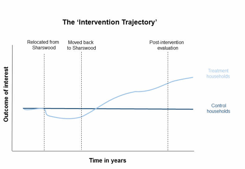
Figure 10: The research design – the “Intervention trajectory”
The expectation is that before the intervention, treatment and control residents appear the same, but relative to the control group, treated residents who return to Sharswood fare better with time.
In order to match treated and control residents we use a common econometric technique called the ‘Propensity Score‘. If the matches are robust, observable differences between treatment and controls groups should all but disappear giving us a useful quasi-experimental foundation for comparison.
Figures 11-13 provide a visual description of the matching quality broken out by variable. Column 1 shows the mean for the unmatched control group; Column 2, shows the mean for the matched control group; and Column 3, the treatment group mean. Ideally, we’d like to see that the matching process found a control cohort for which variable means are comparable to treated means. Comparable means for Column 2 and Column 3 would suggest this to be true. Indeed this is what we see in most cases.
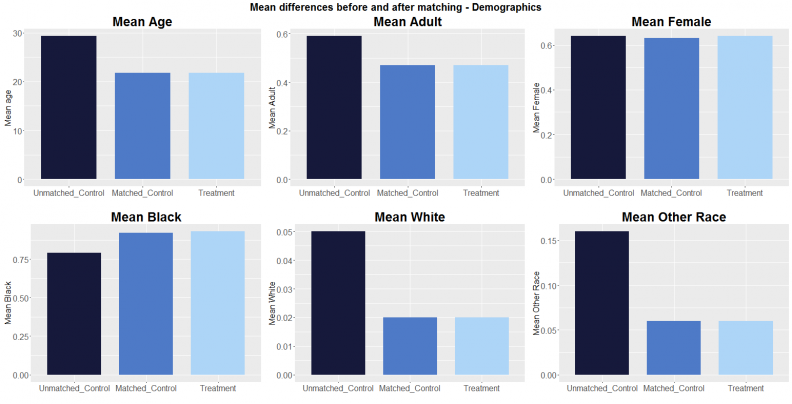
Figure 11: Matching results – demographics
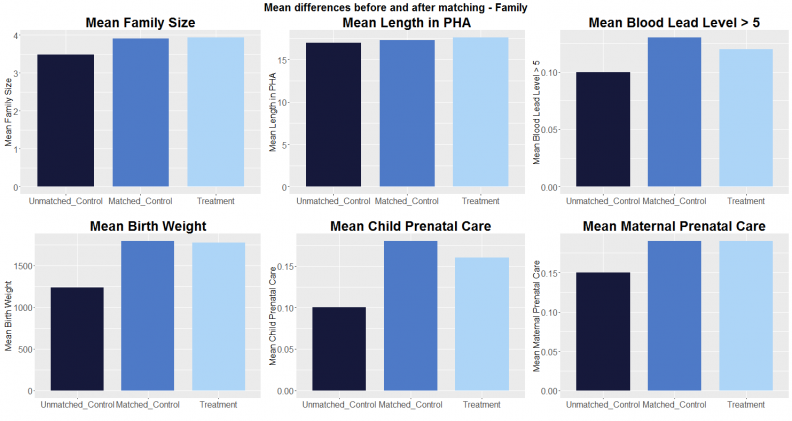
Figure 12: Matching results – family-related
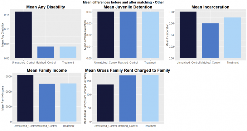
Figure 13: Matching results – other characteristics
Additional matching metrics are provided in the paper. Importantly, we are able to locate a control group that is comparable with respect to age. This is crucial given the need to understand outcomes for children. Figure 14 illustrates the age breakdown by treatment and control residents.
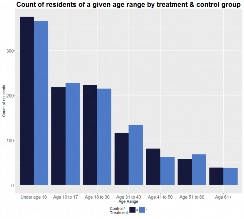
Figure 14: Age by treatment and control groups
Now that we have a robust control group, we can analyze differences at the baseline. Figure 15 shows outcomes for children and adults as well as place-based outcomes, respectively. Few observable differences between control and treatment groups would indicate high quality matches and a useful baseline for studying the effects of the intervention over time.
Difference in mean tests (p-values) suggest we have a robust control group for most adult and children outcomes. The place-based outcomes show the striking environmental difference between Sharswood and PHA housing where Sharswood residents were relocated to Citywide. Crime events were many times higher in Sharswood and property values were many times less.
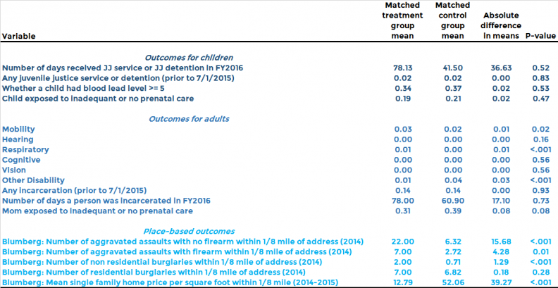
Figure 15: Outcomes at baseline
Consider how vivid the picture these integrated data paint. By linking across-agency data we can observe precise outcomes for individuals; outcomes that were previously only available for census tracts and other arbitrary areal units.
Equally important, because the City collects these integrated data directly, this sort of evaluation can be run routinely and with little expense, allowing stakeholders to modify the program at the margins, if need be. Our hope is to update the study with additional data including education outcomes.
It is also worth mentioning, given the history of large-scale, government-led place-making in the U.S., that PHA deserves much credit both for their housing investment and for a willingness to evaluate their own program. We are excited to follow the program and its beneficiaries as time progresses. Stay tuned below for some bonus data visualizations in the Appendix.
Ken Steif, PhD is the founder of Urban Spatial. He is also the director of the Master of Urban Spatial Analytics program at the University of Pennsylvania. You can follow him on Twitter @KenSteif.
Along with the aforementioned authors, we thank Whitney LeBoeuf, PhD and Katie Barghaus, PhD who made tremendous contributions to this project.
Appendix 1: Additional data visualizations
Given how uniquely valuable these data are, this Appendix provides some additional insight.
To begin, Figure A1 illustrates mean singly family house price within 1/8th mile around each subsidized housing type Citywide. Prices around units that accept Housing Choice Vouchers are clearly lower than the other subsidy types. This may suggest either that voucher holders are choosing to sort into relatively disinvested neighborhoods or that supply constrains arise either from escalated HUD Fair Market Rents or landlords refusing to accept vouchers in higher-valued neighborhoods.
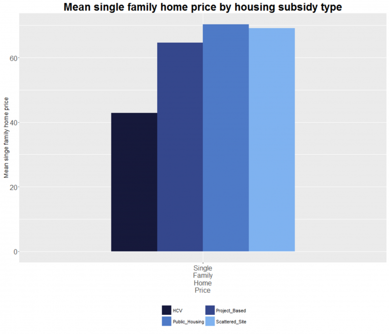
Figure A1: Mean single-family home price by subsidy type
To get a better sense of the distribution of voucher holders Citywide, Figure A2 maps the density of voucher holders in Philadelphia. If you are familiar with the ‘geography of opportunity’ in Philadelphia, it is clear that voucher-holders, by and large, are not able to locate in areas with high quality amenities. The phenomenon is an active area of housing policy research.
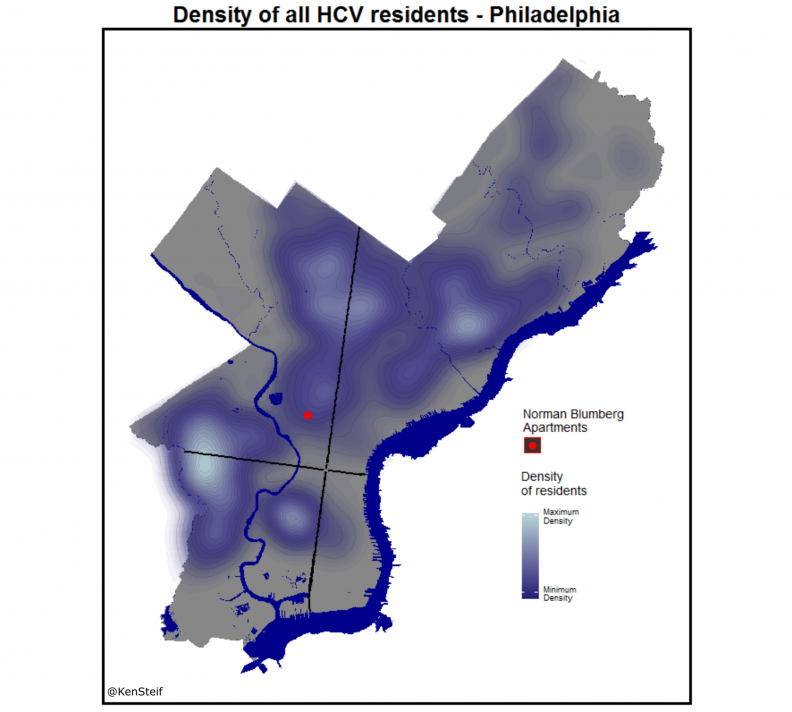
Figure A2: Density of HCV residents in Philadelphia